- Getting out of bed
- Managing money
- Getting lost
- Losing swipe card
- Losing keys
- Confidence issues
- Journey planning
- General organization
- Bad weather
- College building layout
- Learning/remembering names
- Public transport
- Understanding accents
- Loan complications
- Course equipment
- Computer induction
- E-studio
- Remembering passwords
- Food facilities
- N.U.S card
- Take library books back on time
- Fitting in with group
- Eating properly
- Big enough bag to fit sketch books ect
- Housemates
- Halls rooms/space
- Alcohol
- Smoking
- Neighbor’s/noise
- Sleep deprivation
- Stress
- Running out of toilet roll
- Washing clothes
- Visiting home/friends
- Presenting work in big groups
- Rail card/bus pass
- Software management
- Keeping fit
- Tv license
- Council tax
- Deposit for accommodation
- Social/work balance
- Writing skills
- General health
- Work load
- Deadlines
- Creative block
- Meeting people from other courses/years
- Sharing facilities with other years
- Medical arrangements
- Remembering to sign in
- Digital camera
- Hiring college equipment
- Professional work
- Good hairdressers
- P.A.T testing cables
- Blogging
Out of the ten we had to choose three and pass them on.
We were asked to re-write them as questions, choose one and put into a pot to randomly select one.
Group question:
How to budget as a new student during Freshers week?
After some discussion,we have decided to design a simple interactive app that allows a student to calculate their budget for the week.
Background/Considerations
Who needs to know?
- New students/first years
- Futre students
- Current students
- Students that live at home or away
- Price of tickets for events
- Food necessities
- Taxis/Public transport
- Material necessities
- N.U.S card
- Social media (post advertisement)
- Smart phone App
- Web page
- Business card
- Flyers
- Email alert
- Freshers pack
- Student halls pack
- Enrolment
- Open days
- how many times its Downloaded
- Rate the App
- social media Comments/likes
- Smart phone-App
- Computer-Web page
- Down to earth
- Experienced
- Light hearted
- Informal
- Calming
- Reassuring
Name Ideas
- Fund your Freshers
- Freshers Fund
- Fresh Funds
- Fbudget
- Fudget
App Content
- App logo
- Main character
- Home page
- Map/Level
- Information screens
- Budget display
We thought it would be best to assign a role to each member of the group. I am responsible for designing the App logo and Home Page.
Logo Development
Will is in charge of the character design so I asked him to send me the files so I could start to incorporate them into the logo to keep continuity across the App.
Inspiration for the character came from the iconic golden owls in front of the civic hall in millennium square.
I sketched a few ideas out by hand to get a rough idea.
We decided to include the pound sign symbol just to make it clear the App is about finances. I've used random colours in the designs just until the other elements have been created. Then we can decide which colours work best as a whole package.
I like this design the best. The diagonal lines draw in your eyes towards the character, pound signs, then the Name.A lot of the Apps I looked at whilst researching didn't display the name in the logo but I think it works well with the illustration. The type is also temporary until the other designs have been finalised.
Home page
The homepage is were the student will enter their budget for the week. Simply enter the budget into the box and click the arrow to go to the next page.
First home page design.
I think it's too similar to the logo and could do with some dialog to bring the character to life.
Second home page design.
Having the full bodied character with dialog works well and creates an over all more friendly vibe. Also it suits the general illustrative style and direction the App is going in.
As the development of the map is undergoing I have incorporated some of the elements to keep continuity across the platform.
Map development
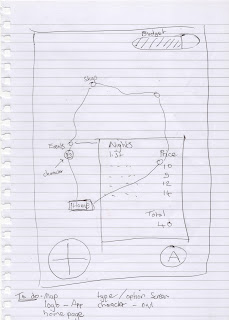
Our initial idea was to design a 2D map with a few points of interest.When clicked it displays some options to choose from. For example, click on the 'Events' button; a page pops up displaying events going on throughout the week and the cost. Select the events you want and the app deducts the cost from your overall budget displayed at the top of the page in the budget bar.
These are the components to go onto the map.
Basic map design
I created this rough draft of the map on illustrator to take to our progress crit.
These are the visuals we used to present to our peers.
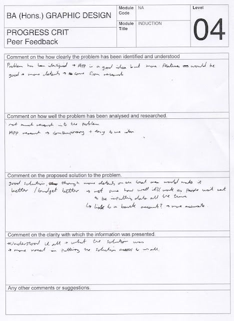
The feedback from the crit was really useful. The main points raised were
- The buttons on the map screen could do with being bigger
- More detail on the map
- link to a bank account
- more features
Final Map Design
We decided to change the river to a train track and add lots of buildings to represent the city centre.
We decided to mount it in a iPhone for a more professional finish.
Home Screen Final
Information Screen Examples
This is the food screen that Amy has designed. The idea is to select your preferred option then press the back arrow to return to the map. There is also some tips on saving money with some links to the cheapest supermarkets in Leeds.
We thought it would be a good idea to design a history page so the user can quickly view what they have spent their money on. To access it you click the budget bar at the top of the map. I think it needs a button to remove items if you wish to change your purchases.
Promotional Designs
App store page
This is the App store page that Sam has designed for promotion. I think it needs a 'rate this App' section at the bottom so can if the app is working.
Business card
Front/Back
This is the business card that Bobby has designed. The idea is to scan the bar code on the back to receive a £5 pound discount when you purchase an N.U.S card.


