Thursday 11 October 2012

OUGD403- Alphabet soup: Illustrator


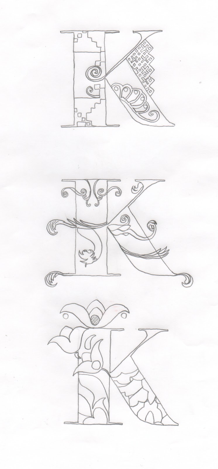
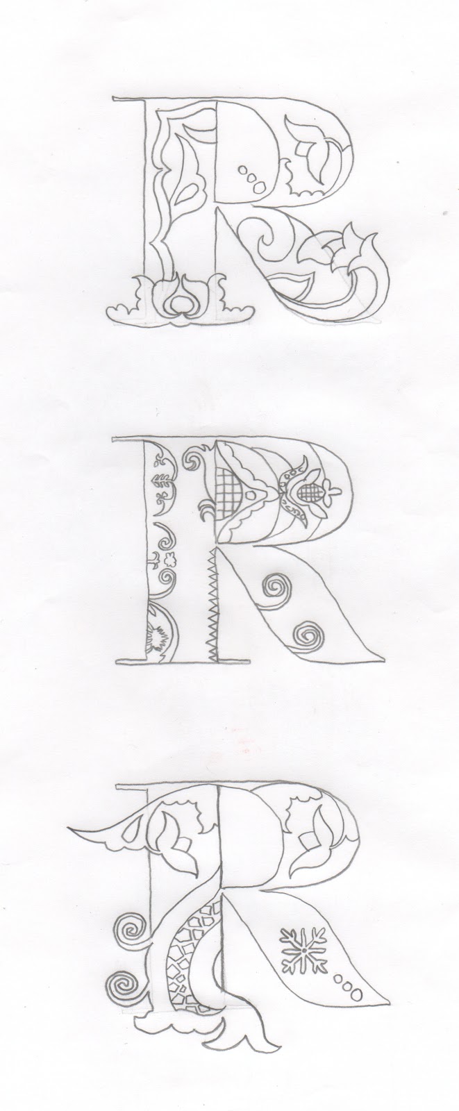
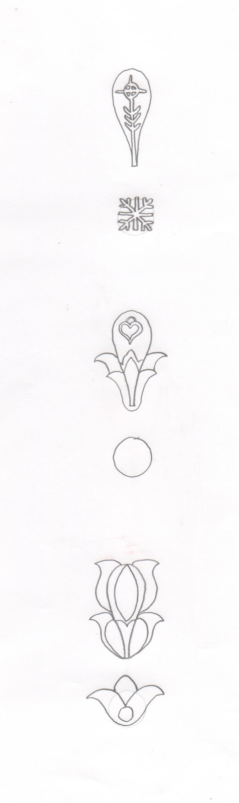
For this brief I am required to produce an alphabet based on one of the letterforms from the Alphabet soup brief.
 In this session Simon introduced us to Illustrator. He started off by explaining the different settings when opening a new document in illustrator. For example, the difference between CMYK and RGB.
 He then went on to set us two task to complete.


Task 1


Pen tool Exercise 


I had to complete seven exercises that focus on the use of the pen tool. Even though I know how to use the pen tool I still enjoyed this task because it refreshed a few techniques I had forgotten about. I completed the task without any issues.


Task 2

Vector Letterforms


For this task I had to use the pen tool to create a vector version of this this hand drawn letterform.


This is how it looked. The right letterform is my first attempt utilising the techniques from the previous task. The left letterform is after using the direct selection tool to refine the overall look.


Continued

Pathfinder
 For this exercise I recreated the letterform from the previous task, but instead of using the pen tool, I created it by using the ellipse tool. I layered the shapes and used the pathfinder to either minus the front shape or combine shapes. This method is really useful to know because it allows you design the same thing a lot faster.
 

Creating Outlines

In this exercise I was taught how to manipulate an existing typeface. To do this I had to convert the letterforms into outlines to allow me to adjust the points with the direct selection tool. This will be useful when I design my own typefaces for commercial work, giving me a starting point to design from.


Strokes
 In this exercise I learned how to use the width tool to adjust the weight of strokes and shapes. This tool is really fun to use and will be useful when creating illustrations.


Blend


In this exercise I learned how to create two styles using the same tool. They are both created using the blend tool. The top image was created by drawing two shapes, double clicking the blend tool and selecting 'Specified Steps'. For it to work you hover the cursor over a corner on each shape and click. The bottom image was created in the same way apart from giving the shapes a colour fill and selecting 'Smooth Colour' in the blend options.


Development 

For the original brief I was given the word 'Layer' to visually communicate through the letterforms. My initial idea was to combine different weights of a typeface to represent the layers from a warped perspective. 


To create my alphabet I used three fonts from the Helvetica Neue typeface.
  • Ultra light 
  • Medium
  • Bold


To start I turned the letterforms into outlines and layered the fonts from left to right, thickest to thinest. 


To finish I filled the body in black with a white outline to clearly define the layers.


Colour Schemes 


I wanted to see what it would look like in different colours so I used CMYK to test it out. I like cyan the best because it looks clean and fresh displayed on the white background.


I started to experiment with different perspective. In the example above I simply moved the bold letterform slightly down and to the right to create a suspended look. I think this technique because it adds depth to the letterforms, however I feel it loses visual quality overall.
In the example below I shifted the bold letterforms significantly to the right. I don't think this style is appropriate because it decreases legibility.


Next I experimented with opacity, changing the medium letterforms to 50% opacity. 


To further explore opacity settings I changed the bold letterforms to 70% opacity. I think this technique is effective in defining the levels and creating depth to successfully communicate layers.


 Final Design


This is my final design with colour and different opacity settings. I changed the medium and bold letterforms to 70% opacity because I felt it was more subtle and created a nice perspective making the letters come out of the page or sink into the page depending on how you look at it.


Tuesday 9 October 2012

OUGD403- Alphabet Soup: Typeface


I am required to design a typeface for a full alphabet and glyphs that represent the personality/character of my partner.

The partner I received is Danielle Muntyan.

We got into our pairs and filled out a simple questionnaire about each other.


I didn't find these questions very helpful in understanding her personality so we had a further discussion about each others interests, character and traits.


I found this image on Danielle's Facebook profile. I think it must of been a similar activity she did at previous education. 

I have highlighted the main points of her personality to give me a starting point to conduct my research.


Character 

  • Loud
  • Opinionated 
  • Friendly
  • Organised chaos
  • Spanish/Italian/Hungarian/Ukrainian heritage 
  • Sociable
  • Confident
  • Feminine 
  • Glamorous 


    Danielle's character traits need to be represented with a bold, eye catching font that also has a feminine touch.


    The font I chose to manipulate is nouvelle vague. I have chosen this font because it combines bold with thin stokes which I think represents Danielle's personality really well.  She's a small person with a big, bold personality thats complimented with a feminine touch.


      Interests 

      • Cake decorating 
      • Baking
      • Tattoos 
      • Piercings 
      • Digital collage- Dawn Gardener 
      • Patterns 
      • Textures 
      • Fashion 
      My initial idea is to design a typeface that incorporates fashion and pattern designs from the countries of Danielle's heritage: Spain, Italy, Hungary and Ukraine.

      To start off I have arranged the alphabet to scale so I can start to experiment with different designs.


      I have selected some of the patterns from my research and arranged them onto sheets to start tracing from.


      Visual Investigation 


      Now I have finished drawing the letter variations I am going to scan them and choose the strongest,  ready to fill areas with black to create the silhouette style discussed in my crit.


      Final Design


      I decided on these letterforms because I feel they work best with the colour. I am really pleased with the out come so far.


      Name Badge


      Because of the size of the name badge I had to descale my letterforms which made the detail hard to see. However the legibility/readability was good so it wasn't a complete disaster.
      To finish this brief off I had to choose a product that I think my typeface would fit. I chose Pandora because I think the decoration of my font works well with the products portraying delicate and intricate jewellery.