Thursday 27 February 2014

OUGD503- Collaborative Workshop3

In the lesson today we had to present our progress so far to the group. We had to crit someone else's brief in our pairs and vice-versa.


We had some good feedback for our brief. The main idea we liked that was suggested was to use different material like crushed paint and drop it from a distant onto the background. After discussing this me and Roxxie thought it would work well with the quilling inside of the letterforms and the textures relating to each product on the background.

So, for example, crushed red paint pigments for the lipstick, a smeared paste for the body butter, drops of paint from a height for the drops of youth and coloured smoke for the white musk.

This means we will have to do some more experiments to test out the background textures.

The lesson today was really useful and has given us a clear path of where we need to go from here. 

Action Plan

-Background experiments

-Final Layouts

-Quilling

-Campaign design ideas and variations

-External Channel ideas 


Wednesday 26 February 2014

OUGD505- Jackson Rising Task 2

Jackson Rising


Background:
This text/image heavy layout will ask you to utilise body copy, title, date, and location, heading, sub heading, imagery, indexes, highlighted quotes. The amount of text allows for the use of imagery and the type to serve as the main visual elements.

Brief:
You are to layout and design a 10-page concertina folded brochure for a forth-coming exhibition titled ‘Jackson Rising’ at MoMA, New York. All images, copy and branding are included. You have to create a visually stimulating layout that showcases the artists’ imagery but does not sacrifice important information in this process. The images and information must flow harmoniously and offer a taste of what is to be expected during the exhibition.

Branding elements must be kept to black and white. Images must be unaltered and in colour.

Considerations:
Headings, headlines, body copy, grid, type, colour, image sizing, bleed, margins, flow, audience, narrative, language, purpose, size, external print methods, preparing for print, stock, distribution.

­­­
Specifications:

Format: A5 x10 – Portrait – Concertina spread (front and back).

Title: Jackson Rising - Curated by Jenny Dowd
Dates: August 3, 2014 - August 31, 2014
Location: 11 W 53rd St, New York, NY 10019, United States


Introduction:
Four artists met at an artist residency at the Ucross Foundation in 2013, now they come together to inhabit at MoMA, New York.

List of artists:

Ruth Boerefijn
Lindsey Glover
Mayme Kratz
Jenny Dowd

Ruth Boerefijn:
My process is experiential. I make visits beyond my self: to Iceland, to the store where the fishermen buy their supplies, to the library.
Description: http://www.ruthboerefijn.com/about/indent.gif
The feel of manuscripts, photographs and maps give my hands something to articulate when later, in my studio, they work knotting and looping lengths of fishing line. It loses form over time, and can be reshaped; it is resilient. The line is a symbol of connection, of reaching into the depths for nourishment.
Description: http://www.ruthboerefijn.com/about/indent.gif
The colored paper is cut from my own drawings from nature-imprinted with other narratives and perceptions-through which I punch holes as a way of forging through them to get to the act of new expression.
Description: http://www.ruthboerefijn.com/about/indent.gif
Text is also a material with a memory and a shape. I struggle to arrange words so they can articulate beyond history to character, story, felt experience, and new possibility.

Lindsay Glover:
Using multiple projections, Lindsey Glover transforms the Loft into a space for the exploration between perception, memory and experience. She collects photograph and video images that are later re-examined to find parallels in context, all the while focusing on the capture and storage of time.


Mayme Kratz:
Mayme Kratz creates art from the natural life of the desert that surrounds her Phoenix home and studio. Viewing collecting as a way of archiving memory, she assembles a variety of natural forms—tangled birds’ nests, feathers, bones, seeds, snakes, and cicada wings—and captures them submerged in resin to create rhythmic, abstract sculptures and reliefs. “My collected specimens celebrate the endless cycles of change and rebirth in nature,” Kratz has said. In addition to these hanging and freestanding works she has also created a variety of videos and installations, including an interactive outdoor sculpture made of found tumbleweeds meant to disintegrate over time.

Jenny Dowd:
Jenny Dowd explores space and movement with a series of steel and Egyptian Paste vessels. The boats hover, dive and flock overhead while exploring the gallery in a playful dialogue.


Contacts:
Ruth Boerefijn: www.ruthboerefijn.com
Lindsay Glover: www.lindsey-glover.com
Mayme Kratz: www.maymekratz.com/
Jenny Dowd: www.jennydowd.com

info@jacksonrising.com                                                                            
www.jacksonrising.com
www.moma.org

Image:
Jackson Rising ident / MoMA logo / NYU logo
Multiple Artist imagery
(Use embedded InDesign file and follow grid.)

Save as PDF file.


Development


To keep continuity with the flyer I have kept the from page the same design.


I have used different weights of the font for hierarchy to separate the artists names from the information.


I have span the first artist across the remaining three pages on the front of the concertina because she's has the most body copy to display.


I have used the black line bleeding from the image to the artist name to make it clear that the information corresponds with the image.

Front


This artist didn't have much copy so I used one spread to layout the information. I have kept the column width the same and will do throughout. I decided the change the type the centrally aligned because I didn't think it looked right in the center with left align.


There was more copy for this artist so I have used two spreads to lay it out.


As this spans two spreads I have used the line to link it to the image as before.


I made the image much bigger on this spread because the amount of type was minimal.


The back page mimics the front but with the logos horizontal and larger for promotion.

Back


Front and back


Although this was a quick exercise it was fun to see how I could work out how to lay it out effectively in the given time. I imagine this would be whats its like in editorial design or generally working with a quick turnaround. 


Tuesday 25 February 2014

OUGD505- Jackson Rising Task 1- Flyer

Layout 1 – Minimal Text / image:

Background:
This simple layout will ask you to utilise a short amount of body copy, title, date, and location. The minimal amount of text allows for the simple use of single imagery and the type to serve as the main visual elements.

Brief:
You are asked to produce a simplistic flyer design for Jackson Rising Exhibition at MoMA (Museum of Modern Art – New York) using the instructions below.

­­­
Specifications:

Format: A5 – Portrait

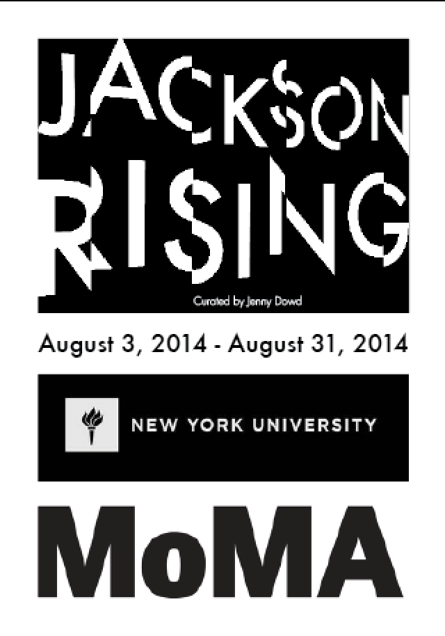
Title: Jackson Rising
Sub-Title: Curated by Jenny Dowd
Date: August 3, 2014 - August 31, 2014

Copy: Four artists met at an artist residency at the Ucross Foundation in 2013, now they come together to inhabit at MoMA, New York.

Location: MoMA, New York.

Contacts:
info@jacksonrising.com                                                                            
www.jacksonrising.com
www.moma.org

Image: Jackson Rising ident / MoMA logo / NYU logo
Use of two colours only: Black and white
(Use embedded InDesign file and follow grid.)
Save as PDF file.


I decided to use future regular and light for the body copy because I think the harsh edges of the letterforms are similar to the heading font and work well together.


To keep to the grid I made the 'Jenny Dowd' copy 10.2pt size and the date 22.8pt with the regular font weight for hierarchy.

The main copy and contact details are inline with the 'Jenny Dowd' copy for consistency. I had to adjust the pt sizes and baselines to make them fit to grid.

 I decided to rotate the logos vertically to make the layout more interesting. They line up with the description copy and the bottom of the contact copy.

Final Layout with Grid


Final Layout 


OUGD505- Studio Brief 1- Contextual Publication

I have narrowed my research down and I have decided to focus on house music.


To get an idea of what to include in the publication I made a mind map of the most significant things I found from my research. I have decided to have four main sections in the book:

-Origins
-Influences 
-Pioneers 
-Genres

I want the publication to reflect the research by taking inspiration from the Chicago roots of house music and the retro style of deign.


Colour Swatches

I have chosen to use these colours because they were used a lot in retro vinyl labels and they work well together. 

C=34 M=11 Y=29 K=0

C=0 M=78 Y=39 K=0


Typefaces

Archivo Black:
will be used for the headings 
 Century Gothic:
will be used for the body copy

Digital Development 


Grid:
8x8

I have decided to use an 8 column grid to give me more options when laying out the content. I want the layout to be pretty structured to reflect the 4x4 rhythms of the music.

The dimensions for the book are 180mm x 180mm.

P1


On the opening page I have used a well know lyric from an early house track as an introduction to the book as the lyrics are fitting.


P2


For the body copy I used 10.5pt size with 14 space leading aligned right. This fits nicely in the grid and allows me use two columns if needed. I have made 4/4 the width of the column to draw main focus on the page. 


I have made a simple illustration to communicate the 4/4 rhythms of the music.


I placed the illustration on the opposite page mirroring the position within the grid for a balanced layout.


For consistency I am going have the main heading in red and black and the subheading in green. The colours and orientation creates hierarchy when reading. 


I felt the page was to minimal so I added a loop symbol with a low opacity to give the layout some depth.


P3

I have decided to focus this page on The Warehouse and Frankie Knuckles as they were both huge influences to house music.  


I changed the layout of the quote and smaller body copy to work better with the image. I think it reads better this way because it leads the eye from top to bottom.


P4

For the genres section I am going to keep it typographic to communicate the styles of music associated with the genre.


I experimented with different pt sizes and weights to try and visually communicate the differences in sounds.


I placed the body copy on the opposite page keeping to the grid.


I wanted the genres to stand out so I tried adding block colour behind it for contrast. As there are so many different genres i though an image of stacked records would work behind the type. I added a green tint to the image to compliment the red Chicago type.


P5

I wanted to include Marshall Jefferson and the song 'move your body' in the influences section because it was the first song to introduce piano into house tracks and his song was one I liked from my research. 


I wanted to use the original vinyl label on this page for the main focus.


The lyrics were iconic in the song so I have used them alongside the image, the colours are used to break up the most important words.


For the image to be the focal point I made it bleed across both pages leaving space for the body copy and lyrics.


P6

For the final section of the Influences section I have included the record label Trax because they were one of the biggest at the time.


I wanted to highlight the type on the image so I duplicated the image.


I had to use a two column grid for the copy on this page but the column widths are the same as the previous pages for consistency. 


P7

For the pioneers section I am going have a list of Influential DJs and producers from the Chicago period.


I wanted the type to be in a circle so I created a grid in illustrator to help align each name. I originally was going to use this around the loop symbol from an earlier page but it had to be too small to fit on the page and lost impact so I decided to just have the type spanning across both pages.


The way it reads makes you move the book clockwise mimicking the movement of a vinyl so I have used and image to support this.


I had to edit the image in photoshop to lower the brightness and add some noise to make it look old.


Last Page 

I have used a quote from my research that sums up house music to end the book. 


I have used an image of a close up of a vinyl to add some texture to communicate the idea of it being a feeling.


Final Publication
.


Mock-Up

Before I printed the final piece I printed in black and white to make sure everything was ok. 


There were a few mistakes on some pages and i needed to higher the opacity of a photo so Im glad I printed it.


Above is the final book printed on antique white stock. I chose to use this stock because I think it compliments they red and green colours throughout the book and it adds to the retro theme. Once Ive made the covers I will need to bind the pages.


Packaging


For the packaging I am going to design a 7inch Vinyl sleeve that the publication will slip into.

Packaging Nets 


I tried a few different nets but I am going to use the one above for my packaging because it will allow the vinyl label on the front cover of the publication to show through.


I made a quick mock up of the net just to make sure it worked. It did.


Final Packaging 


I have used the same illustration as one of the pages for the sleeve design. I think it look good withe black vinyl label showing through. I will print the packaging once I have finished the publication because I need to see how big the width of the spine will be.

Vinyl Stickers 


Stickers to go on the front and back of the vinyl covers. 


I used the laser cutter to cut out the front and back cover. 


To attach the vinyls to the pages I have stuck them to black card. I have left a 5mm spine on the card so the book will open flat and I will be able to bind the pages to the spine by sticking it.


I re-printed the book to amend the mistakes that were pointed out in the last crit. Once I had cut it out I had to pierce wholes in the spine to bind.


 I marked the stitch holes in the pages first them held attached it to the covers with dog clips so I could get the wholes in the right place.


I have used a saddle stitch to bind the book. The stitching is a bit loose on the outside so if I have time I might re-do it for a better finish. 


I cut out the packaging and assembled it but I am am going to have to do it again because the dimensions are out, the packaging is slightly to big. 


Final Book and Packaging