Brief
Create an appropriate print based and online presence that can be used as a focal point for your design practice, professional communications and visual identity.Think about how you can stand out from the rest, make yourself recognizable and communicate your professionalism as well as your creativity. You will also need to include relevant contact details. Your design Presence should consist of:
PART 1: YOUR VISUAL IDENTITY.
Your own professional visual l identity for 'Brand You' and apply it to an appropriate range of stationary and promotional material. You should aim to create a simple but effective visual identity that communicates the essence of your creative 'image' and details about your emerging design practice. You will need to consider the practicalities of your identity which may include a logo or bespoke typeface. How readable, legible and usable is your identity?
PART 2: YOUR PROMO PACK.
A promotional package the communicates your skills, abilities creative concerns and professional competencies to appropriate sectors of the creative and cultural industries. This pack should include a business card, introductory information, samples of work a creative CV, contact details and other relevant material and information
PART 3: YOUR WEBSITE.
You have been introduced to the fundamentals of web design and web design software through a series of workshops in previous modules. Based on these workshops propose/produce the structure and content of your own personal website. Keep it simple and make sure that your visual identity forms the basis of your online brand.
IMPORTANT: You will be responsible for any online content uploaded and/or distributed as part of this module. Can you please ensure that all material is original, belongs to you and complies with the guidelines for online activity outlined as part of your general Mac suite induction. If you are unsure about any content that you intend to upload please discuss this with your tutor
Background / Considerations
You will need to consider:
Scale: Your identity will need to work across a range of scales and formats from the the size of a projection screen to that of a letterhead.
Content: Too much and it becomes confusing, too little and it will not communicate. Too complex and it will not be practical. Too simple and it will be unrecognizable.
Color: It will need to work in mono (one colour or b/w). It will be cheaper, more practical and easier to (re)produce. Think how the color of the stock can help.
Production: The quality of the stock can say as much as your design. It can also make your design unreadable and illegible. Consider how it will be produced, by who and using what processes.
Monday 28 April 2014
Tuesday 22 April 2014
OUGD505- Studio Brief 2- Massive Crit


The main feedback I received from the crit on my publication and proposed idea for studio brief 2 was really beneficial. Main points made about the publication were the colours could do with being more vivid to have better impact. I agree with this and I will address this when I re-print the book.
The suggestions I got for the printed collateral for studio brief 2 were what I was thinking of doing anyway:
tickets
posters
vine/whats on guide
social media
website?
interior/exterior
promotional products to advertise the events
letterheads
business cards
Cd design
I will take these suggestions into consideration when I come to develop my ideas.
Publication/ Research Book
My research book was written on to point out the mistakes I had made that needed addressing. The main issues were spelling mistakes but the colours were pointed out as well.


Amendments
I had my booklet re-printed after I had amended the mistakes that were pointed out. Im glad I had the crit because there were a lot of mistakes that would of gone un-noticed otherwise.

I made a mistake with the printing and had to print it for a third time. It was a patience testing experience but I am glad I persevered because the resolution is much better than before. I am now happy with the design.

Film Poster

As I had a print slot I had my dil poster print to A3 format ready for hand in. One less thing to worry about.
Monday 21 April 2014
OUGD505- Studio Brief 3- Film Poster
Initial Ideas

In this scene Jack Nicholson gives Meryl Streep a white rose before she performs a song about their friendships. This scene is iconic so I am going to use the white rose to represent the troubles of his past and how their friendship is something good to come from it.
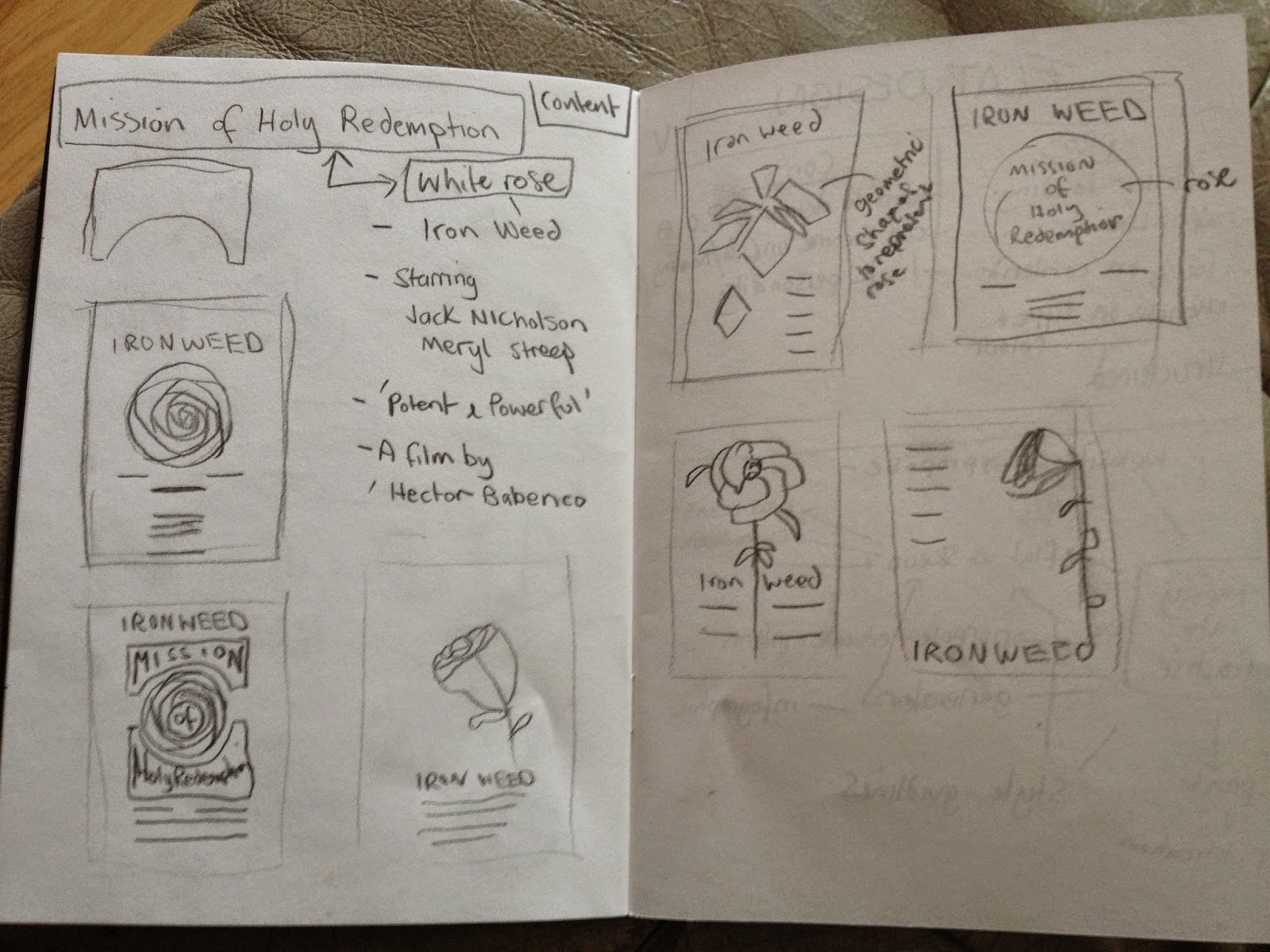
I sketched out a few ideas to get a rough idea of layout and how best to use the type with illustration. I want the rose to be the main focus so I think having it centred will be the most appropriate.
Font
Market Deco

I chose to use this font because I felt it reflected the setting of the film and the time it was produced.
Colour Scheme


Red and black will be the main colours with white being the stock colour.
Digital Development


I started off by making the structure for the rose. I did this using different shapes and rotating them 360 degrees.


I made duplicates of the rose to try out different brush finishes to soften the harsh vector lines. I am going to layer the different finishes with varied opacities.


I layered up two of the roses and tried a font similar to the original poster to to see if it would be more appropriate than the one I originally chose. However, I don't think it communicates an alternative poster so I am going to stick the my first thought.


Next I tried a different approach by keeping the rose geometrical and with the different font. I am going to keep the typographic content to a minimum to allow the rose to draw focus.


I wanted to see what different colour ways would work best. I like having the type in different colours, I think it helps to break up the information giving clarity.


I felt the rose was too conceptual so I added some detail to make it clearer to what it is.
After some reflection I think the minimal geometrical theme doesn't represent the film in the way I am wanting to communicate so I am going to re-think my design.

I wanted to reflect the movie better so I started again with the illustrations. I want to create a posterised feel by using brushes and different opacities.


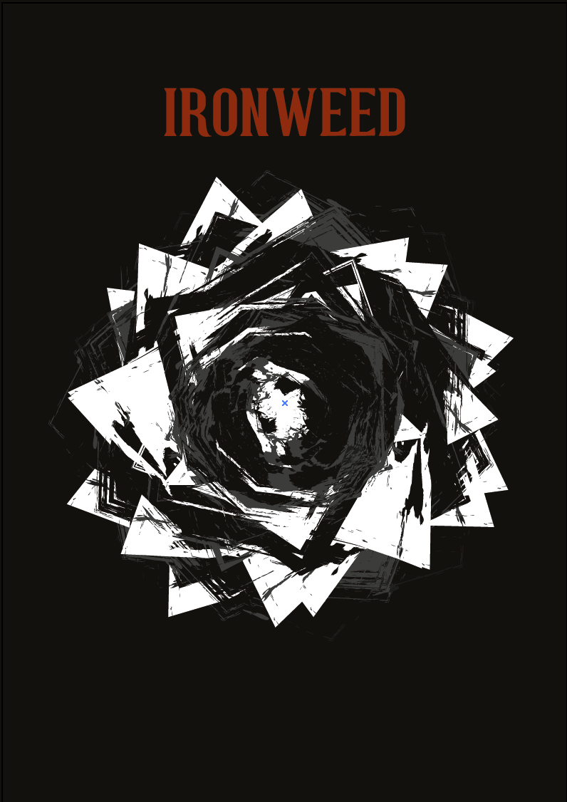
In the film, the two characters are alcoholics so I wanted to represent this in the design. I created a swirling circle around the rose to represent this.

To further clarify the type I changed the outlines and underlined the director name with red to relate to the film title and actors.

To finish off the poster I applied the upper arch warp to the title to follow the circle and create depth.

Final Design

I am really pleased with the outcome and feel its a good representation of the film as a whole. It looks like I have used more than two colours but its just different opacities which I think has worked well to not create a static image by creating depth.
Monday 14 April 2014
OUGD503- Summative Evaluation / Module Evaluation
Overview Evaluation
Throughout the responsive module I have covered a variety of briefs that have challenged me in different ways. I have partaken in competition briefs and live briefs and have enjoyed both for different reasons.
Throughout the responsive module I have covered a variety of briefs that have challenged me in different ways. I have partaken in competition briefs and live briefs and have enjoyed both for different reasons.
The collaborative brief was one of my favourites in regards to competition briefs because I enjoy working with others. I find the responsibilities that come with working with someone else helps me to focus and perform to the best of my ability to get the best out of the brief. I feel my crafting skills have improved vastly from conducting experiments and trying out paper crafting. This was a technique that was new to me and I found really interesting and engaging. This makes me think I would like to further explore this in the future.
The individual brief was a bit of a disappointment overall. I found it really difficult to visualise my concept as it was all proposed and required me to mock-up my designs. I realised my software skills are not at the level that I want them to be so I am going to address this over the summer period to allow me to finish visuals to a professional standard. I messed up my time management on his project and didn't allow myself the time to do the brief justice. I still need to improve my analysis of briefs to break it down to identify a specific target audience to design for to make the designs relevant.
The briefs I completed that were self initiated were a good experience with working for clients and producing work for professional outlets. This has given me more scope as to what will be expected of me when I go into the industry. I have learnt about preparing work for print and specifying pantone colours for consistency, particularly, when it comes to branding and using spot colours. I am getting better at working faster and more productively however, I still find it hard to management my time, especially when working on multiple brief at the same time.
Module Evaluation
I have improved in developing concepts and pushing ideas to get the best out of the brief as well as discussing ideas and taking on board feedback to improve my work. I have had some tight deadlines to work towards which has given me confidence in my ability to work under pressure to meet the clients needs. I will capitalise on this by continuing to develop my critical thinking and awareness of the target audience to keep my designs relevant and communicate a specific purpose.

Module Evaluation
1. What skills
have you developed through this module and how effectively do you think you
have applied them?
I have learnt a variety of skills throughout this brief such as preparing artwork for print, Specifying Pantone swatches, producing work for a quick turn around, Pitching ideas and concepts to clients, and presenting work to a processional standard through design boards and final resolutions. I feel I have applied this throughout the briefs I have completed by developing a strong concepts that fulfil the briefs outlines.
I have learnt a variety of skills throughout this brief such as preparing artwork for print, Specifying Pantone swatches, producing work for a quick turn around, Pitching ideas and concepts to clients, and presenting work to a processional standard through design boards and final resolutions. I feel I have applied this throughout the briefs I have completed by developing a strong concepts that fulfil the briefs outlines.
2. What approaches to/methods of design production have
you developed and how have they informed your design development process?
The majority of work I have produced throughout the module has been mainly digital based. I have improved my software skills however, I feel it needs a lot of improvement to reach the level of professionalism I am wanting to achieve. For the collaborative brief, I have improved my crafting skills greatly and feel very confident in my ability to produce work to a high standard. I have really enjoyed working with paper and taking a more hands on approach to design which is something I have shied away from in the past. This has made me think I would like to further explore working with paper and structural design.
The majority of work I have produced throughout the module has been mainly digital based. I have improved my software skills however, I feel it needs a lot of improvement to reach the level of professionalism I am wanting to achieve. For the collaborative brief, I have improved my crafting skills greatly and feel very confident in my ability to produce work to a high standard. I have really enjoyed working with paper and taking a more hands on approach to design which is something I have shied away from in the past. This has made me think I would like to further explore working with paper and structural design.
3. What strengths can you identify in your work and how
have/will you capitalise on these?
I have improved in developing concepts and pushing ideas to get the best out of the brief as well as discussing ideas and taking on board feedback to improve my work. I have had some tight deadlines to work towards which has given me confidence in my ability to work under pressure to meet the clients needs. I will capitalise on this by continuing to develop my critical thinking and awareness of the target audience to keep my designs relevant and communicate a specific purpose.
4.
What weaknesses can you identify in your work and how will you address these in
the future?
The main weakness that I need to improve is my general organisation and productivity. On some briefs I have taken far too long on different aspects of briefs which left me with limited time on other sections. I need to balance out tasks and allocate specific days to achieve pre set out tasks for better productivity.
The main weakness that I need to improve is my general organisation and productivity. On some briefs I have taken far too long on different aspects of briefs which left me with limited time on other sections. I need to balance out tasks and allocate specific days to achieve pre set out tasks for better productivity.
5. Identify five things that you will do differently
next time and what do you expect to gain from doing these?
- I will organise my time much better in the future so I can fully explore ideas and produce a larger body of work such as proposing additions to main deliverables to show I am willing to go the extra mile.
-I want to improve my research skills and explore a wider breadth of material to gain a better understanding of the subject to help with ideas that may not be so literal. This could help to think of solutions that are more considered and individual
-I think I would like to experiment more with hands on methods of production as the majority of my work has been digital based. I really enjoy working digitally but I am concerned my work could become sterile and predictable.
-The briefs I completed involved a lot of branding. Although I really enjoyed them I wish I had tried a few different fields of design. However, saying this, whatever the clients request I needed to respect this on produce the work even though I might not of enjoyed doing so. In particular, I am bored of designing images for social networks and would like to move away from this.
-I had to mock up a lot of my work as it wasn't always necessary to produce printed versions however, I would try to produce more in future so I can take some photos to build a body of work to use in a portfolio. This is something I need to start thinking about as my portfolio will be what sets me part from other designers when applying for jobs.
Subscribe to:
Posts (Atom)