Monday 30 December 2013

OUGD504- Brief/Concept


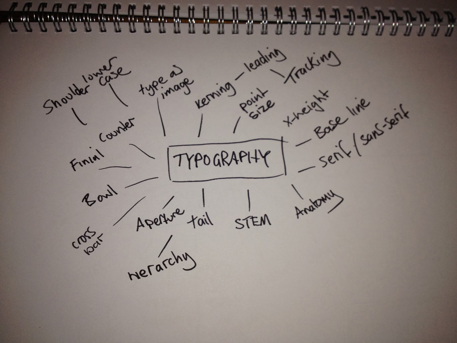
As the restaurant has to be typographically themes I thought it would be a good starting point to write a mind map of words that came to mind in regards to typography. The only word that stood out to me was type as image which I thought I could incorporate into the logo.

I felt I wasn't getting any further with this so I decided to move on.


I started a new mind map linking words to Japanese dinning to try and think of a name and to help me understand who I am designing for. Alongside research I came across the name 'Tenjin', which is a Japanese God of language and calligraphy, he also taught humans to write. I made the decision to use this as the name of the restaurant which is an extended link to the typographic element to the brief.


I wanted to create a restaurant/bar that serves small sharing dishes. I started to think of a menu to inform some of the print material and to help me gain a better understanding of the identity. As I was researching I came across a style of Japanese cuisine called 'Yakitori.' This is a type of food that is on a stick that is grilled to order. 


Next I wrote down all the details of the bar/restaurant to help me design to a specific target audience. I decided to make the bar really bespoke only serving yakitori with limited Japanese drinks for a unique experience. 

The bar is meant to be a real sociable place that people can go to try a selection of flavoursome finger food in an energetic, friendly environment.

Tuesday 17 December 2013

OUGD504- Ebook

Book
Pullouts

OUGD504-Production

I printed the the cover pages for each process to get a feel for what the colours would like like together and with the bold black ink.


I think just having black ink will work well because the colours are so vivid. After my crit It was mentioned that the yellow and orange were a bit to bright compared to the other colours so I have re-ordered the stock with the yellow and orange toned down and the pink more of a salmon colour.


I wanted to see if all the pages worked when each section is put together so I mocked up the book to get a better understanding of how it works.


The changed the ordering of the processes because it was mentioned in my crit. It think the order is more logical now and I feel the design is ready to be printed. I am going to digitally print the book to control costs.


Now I have my book printed I started the production process.


The first thing I had to do was cut all the pages to size. I did this by hand so i could use the registration marks to to get the same size for each page.


I was originally going to screen print the front and back cover onto navy mount board but the back of the board was bright white which I think would look really harsh next the soft colours of the pages, so I decided to digitally print the covers and stay mount on to the white side. I think this has worked out well with the contrast of colours.


This is the order that the pages will be in. Im glad I decided to use different stock to my original stock. I think it works much better together.


Now the pages are ready to be bound. I am going to coptic bind the book so the spine will look like this from the side, revealing the colours of the pages.


These are the posters that will be at the back of each section. I need to buy some velcro pads to attach the posters so they can be removed without damaging the book.


I folded the posters in half then into three sections.


The bind the book I had to punch holes in each section. 


I decided to use three nots at the top and bottom of the spine to give the book extra strength. 


Four hours later...To finish the bind I had to tie off the thread on the inner page, I double knotted it to make sure it doesn't come loose.


I pretty pleased with the result, its a little rough in some areas but I quite like it, I think it gives the book character and adds to the purpose of the book, as its about being hands on and all. 


Next I secured the velcro dots to the posters so I could attach them to the pull-out page. 


With all the pages in place the book looks is a bit bloated. Thinking bout it now, I should of made the binding looser to compensate for this. Finally I trimmed the edges of the pages to neaten it up. 

Thursday 5 December 2013

OUGD503- Studio Workshop 3

Lesson Powerpoint


Cost
-In terms of time
-workload 


No Bullshit!


What can you do?


What could you do?


Finish the brief then push it further?


Bring questions for next week.


Wednesday 4 December 2013

OUGD504- Creative Suite Workshop 4

In the lesson we had to find the faults in an Indesign document:


8 Errors 
-Background colour isn't set up to the bleed 
-Missing link
-Pink and green swatches being used which are not needed (7 colours)
-Blue was set to RGB colour
-Yellow bird image is 72dpi instead of 300dpi
-Third bird image down is RGB
-Dimension of the first bird is much bigger than the others
-The text on the last page is set the registration instead of black ink

When saving a document for print there are two ways to do this. The first is by packaging the file in Indesign and the second is by saving it as a pdf. Press quality is the best pdf preset to save for print.

This lesson was a good exercise to put everything we have learnt into practise. It reminded me of some of the techniques that can be used to help avoid errors when preparing a document for printing.