Friday 30 November 2012

OUGD405- Deception Design Boards

Here are finals for my designs boards.

Primary Research Board


I have arranged the results from the questions I asked my peers and friends. It was interesting to see that the majority of people perceived the illusions in the same way. 

Secondary Research Board


I decided to focus this board on visual material with a few key words relating to the different fundamentals of visual deception that I have researched. 

Focused Research Board


I decided to focus my final board on negative space because I find it the most intriguing technique of visual deception. I find it interesting how the space can create different meanings. For example, in the image above, I created blocks of colour working against the angles of the lines in the image to create a disjointed perspective.

Wednesday 21 November 2012

Introduction to Printing Processes

Introduction to 
Printing Processes

We were introduced to different printing processes at Vernon street. The processes included Linoprinting, Letterpress and monoprinting. I had a go at Letterpress and Monoprinting because I hadn't done them before. I had already tried Lino printing whilst at college.

Letterpress 


Letterpress is relief printing and involves woodblock type, inking it, and pressing it against paper to form an impression.


Monoprinting


Monoprinting involves inking a surface, overlaying a material with elements cut out. This allows the ink to leave an impression on what ever is placed over the top. To get a good impression it's pressed by a roller. 

It was good to be made aware of the different processes however I didn't really enjoy this induction because I prefer to work digitally.


Tuesday 13 November 2012

OUGD403 Message and Delivery: Distribution


Below are my initial sketches and ideas for my mail shot.


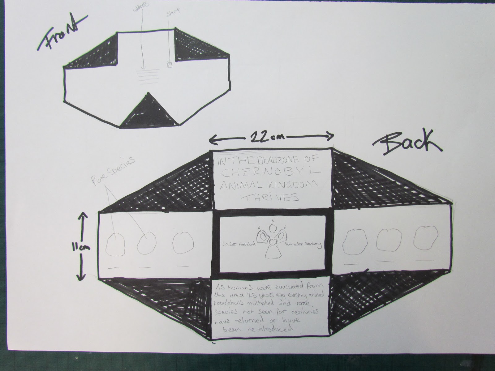
I started by thinking about designing a pull out in the shape of a nuclear symbol. The idea was to have flaps that fold out with information underneath.


This is a mock up to see how it would work.


I found that I would have to fold it in half for it to fit into the envelope which I felt would compromise the design.


I decided to leave this idea because I felt it would be too small to fit all the information on without it looking cramped.


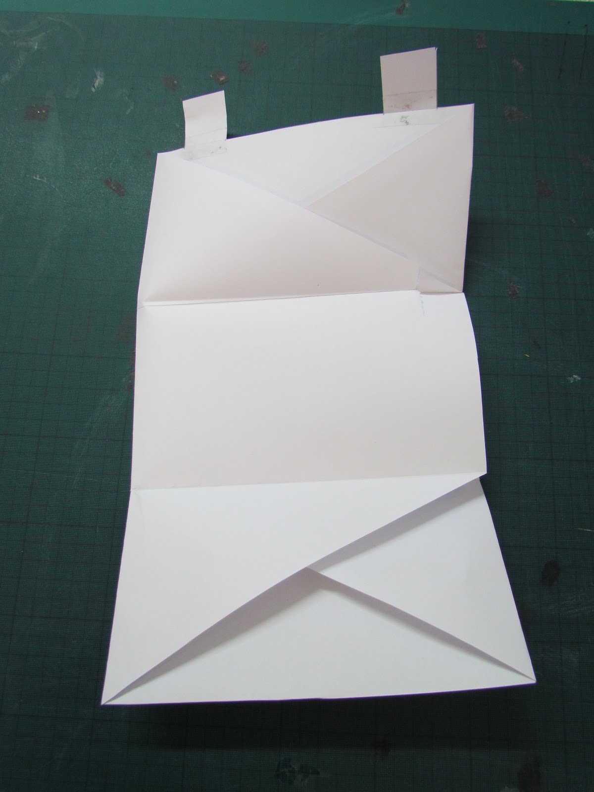
I revisited my initial ideas and decided to develop this one. The idea is to have the envelope and the mail shot all in one piece. I designed it to fold out which will allow me to fit the information on in a more efficient way.


This is a mock up I made just to make sure it would work before developing it further.


I designed flaps on the top to secure it so it can be opened up without being ripped by glue.


Digital development

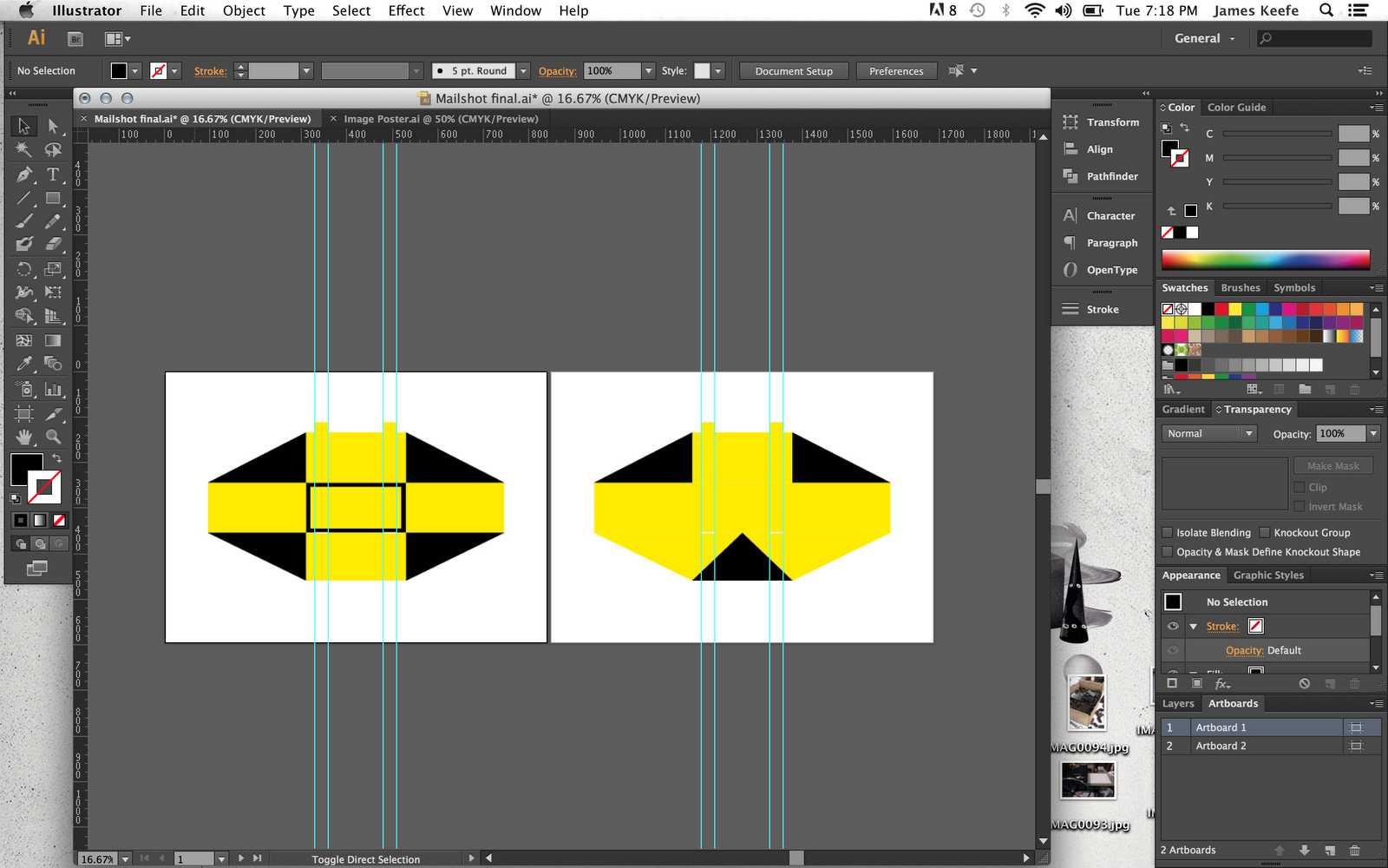
Now I have decided on my design I have started to develop it digitally. I started off by making the net for the mail shot.


The width of the mail shot is 66cm so I had to make it A1 for it to fit.

Inside of the mail shot


Next i started adding text. I changed the text from my poster to make it more clear what the message is about, as that was one of the points made from the poster crit. I used the same font to keep continuity across the media.


On the side sections I wanted to add some off the endangered species documented in Chernobyl to make it more clear what the message is. I found images of the animals and edited them in photoshop first. I changed the threshold to achieve a stencil look.

Finally I opened it in illustrator and live traced the image. This created a nice clean vector finish which I felt was appropriate for the overall style.


The two images below is how it looks with all the animal images completed. 


This is the design with all the elements added. Im pleased with the outcome so far.


Outside of the mailshot


The triangle at the bottom is meant to subtly represent the nuclear symbol.


After I finished my designs I went to inquire about printing and discovered that you cant print double sided on A1. This meant I had to alter the dimensions of my design. To overcome the problem I reduced the size of the side sections to allow it to fit on A2. 


Final Design

Inside


Outside


Next I started sketching some ideas for the mailing list.


I wanted to keep it simple and in keeping with the posters.


This was my first digital design. I decided it had too much going on and needed to be simplified. Also I didn't add the addresses of the companies I chose to send it to so I developed it further.


Final mailing list design


Final Product


Monday 5 November 2012

OUGD403 Message and Delivery: Research 2


What statement/fact/question are you intending to communicate?

I want to communicate nature overcoming the grievous  mistakes of mankind.

What is the tone?
  • Positive
  • Inspiring 
  • serious 

Who are your audience?

  • I will aim my work towards young adults aged 18-25.
  • People interested in nature/wildlife


Type content ideas 


I started off by writing some ideas for the text. I wanted it to be short and punchy whilst communicating the message as clearly as possible.

Poster Content


Visual Research and Development

Initial sketches and ideas


Type


I like the bottom left thumbnail in the image above. It has given me the idea to base my posters on warning signs as they are high impact. Im thinking of using a stencil font and a bold font to create a militant looking style.


Image


I wanted to include the nuclear symbol because it's instantly recognisable and communicates the subject well. I like the idea of combining the nuclear symbol with a symbol that represents animals. For example a paw print.


Type and Image


The top left above has the most impact,simplicity and is in keeping with the signage theme.


Out of the thumbnails I think these are the most appropriate for the brief. I have decided to develop these ideas further because I think simplicity works best to achieve immediate high impact. I have chosen to display my posters landscape because I wont them to look like warning signs.


Final Designs

I chose to use yellow and black for the colour scheme to mimic the nuclear warning symbol. 


The fonts I have used are Impact and Stencil. I enlarged the point size of key words within the statement to reinforce the message. Finally I added lines to break up the text to make it easier to read. 


The tried the original thumbnail idea but it didnt look right so I used negative space to combine the two symbols. I think this works better in communicating the message. 


This poster links to the image poster to explain the message clearly.