Wednesday 30 October 2013

OUGD503- Studio Workshop 1

We were asked to write a list of things I want to get out of this module:

What I want to get out of this module?

- Increase my workflow to allow me to work on multiple briefs
- Finish work to industry standard 
- Present work to a professional standard
- Improve time management 
- Understand the audience 
- Move out of my comfort zone to challenge myself
- Get my work out there to reach a wider audience 

Next we discussed what we had written as a class. 

Group List

- Time Management and discipline 
- Understanding realistic timescales 
- Effective professional communication 
- An award/prize/frame
- How not to get exploited/including getting paid
- Work on a range of briefs 
- Identifying individual practises 
- Brief Analysis 
- Creative compromise 
- Exposer 
- Portfolio development
- Contacts and opportunities 

Next we had to write a list of why I think live/competition briefs are useful:

Why are they useful?

- Create other opportunities 
- Source of income/ placements 
- Work on a variety of briefs 

Next we discussed what we had written as a class. 

Group List

- Improving professional practice 
- Challenge of professional brief
- Commitment to being more than a student
- Developing clearer/ efficient working practice 
- Real world benchmarking 
- Professional responsibilities 
- Confidence 
- Contacts to industry 
- Professional feedback
- Professional experience 

Next we had to write the reasons why I chose the five briefs we were asked to bring in.

- Penguin design awards 
- Packaging as a marketing tool 
- Cats and dogs 
- Transparency international 
- Eezy tooth bruch logo design

Why I chose the briefs?

- Challenging 
- Interested in the subject
- Money prize 
- Change of placement 
- Reach a wide audience 
- Substantial/simple

Next we discussed what we had written as a class.

Group List

- Straight forward 
- Short and simple 
- Free to enter 
- Interest/ Familiar with content
- Ethically motivated 
- Prize
- The best that was available 
- Creative freedom
- Range of problems 


We got into group and broke down a previous brief from Churchill by answering the following questions:

What is the problem?
- Make children aged 11/18 be more aware of who Winston Churchill is.

What is the brief asking you to do about it?
- To inform and educate.

What is the brief trying to achieve?
- To improve knowledge and awareness.

Who will benefit?
- Parent, children, churchill company, England.

What is the message?
- Winston Churchill was voted the greatest Britton.

Who is the audience?
- 11/18 yr olds, people who don't know who he his.

How will the message be delivered?
- Wasn't specified, appropriate media.

Can you foresee any problems with this?
- Whats the purpose, tone of voice used.


We thought the brief was well written and had plenty of information to work from. However we went round the class and discussed each question and Fred answered each question suggesting the real motives to the brief. 

What is the problem?
- The brand is worried about going bankrupt.

What is the brief asking you to do about it?
- They are worried and need help

What is the brief trying to achieve?
- They want more money

Who will benefit?
- The company 

What is the message?
The company creates a stupid identity using a dog.

Who is the audience?
- Children/teenagers who are not eligible for insurance.

Fred summed up by saying competition briefs can be a scam by hoarding thousands of ideas for free that that they may later use without your consent. this made me realise the importance of selecting the write brief to get what I need from it. 


Tuesday 29 October 2013

OUGD504- Studio Workshop 3

Todays workshop focused on the function of a website, in particular the navigational elements.


In groups we had to make a list of common/uncommon navigational methods we have seen on websites:


We discussed our findings with the class. This gave me a better understanding of usability and the options available that could be applied to my design.


Next we had to write a flow diagram based on the content of my site. I was thinking it could get annoying having to go back to the homepage after every section so Im still not sure if the pages need to link together .


Next we had to deconstruct the homepage designs we had sourced by drawing grids on them to see the structure of the design.


The website above is minimal and extremely functional. It uses a three column grid to organise the content into the centre of the page. This maximises space and allows the eye to time to digest. The use of colour helps in breaking the information up into three sections which makes it really easy to navigate. I really like the overall design of this site. I want to use bright colours and flat design in my website so this is a good reference.


This site uses a similar layout to above. The content is split into three columns and centred. The links are at the top of the page which is really easy to navigate. I don't like how the contact information is on either side of the page displayed vertically so you have to tilt your head to read it.  


This page uses a 5 column grid with the logo centred at the top. The main links are under the logo which then leads the eye down to the five sub-categories. This site is more visual so the pictures work as links which is a technique I think works well. One section of my site is going to be design examples so this could be a good way to organise the content.


This layout uses a  mathematical equation to organise the content. The links are at the top right hand corner and it uses colour to distinguish the different link topics e.g orange is for the social networks. The overlapping images creates depth which is a technique I could incorporate into my designs to communicate the ideas of perception. 


This layout uses a nine column grid with the content evenly spaced. The navigation is at the top of the page and uses a search bar and drop down menu. Its pretty basic and very functional but I feel lacks impact. However the alternation of the size of circles creates a balanced layout. 

To summarise, similarities with every site are the display of links at the top of the page with a logo. I initially wanted to have my links at the bottom so I may need to re-think this when I come to designing my site.

Monday 28 October 2013

OUGD504- SCAMPS

I started by sketching thumbnails to get a better idea.


SCAMPS


In the scamp above, I want the eye to look at the links when they are clicked which will activate the page to scroll up on to the following pages. When the cursor hovers above the title 'visual perception', I want the eye to rotate 360 degrees in different directions until the cursor is moved off the title.


My section idea was to have the main content displayed in the middle.The page scrolls up manually or when the links on the right are clicked. The eye on the left will blink randomly and act as navigation to return to the homepage.


This is my lest favourite design as it looks dated. To load the pages you simply click the links on the left which load the following pages.


OUGD504- 5 Examples of Website Designs

You are required to print off 5 of what you consider to be the best designs and bring into next weeks session.


http://www.mosne.it/about/


I chose this website because of the simplicity and colour palette. I find pastel colours really appealing at the moment. I also like the easy to use navigation at the top.


I like the layout of this site because it uses a grid system. The grid helps to organise the content to make it easy to navigate.


This site has five columns that expand when clicked. This is a clever way to utilise the space.


Ive come across a lot of sites similar to this at the moment and i like them because of the minimal style. I have found out this style of design is a up and coming trend called 'flat design' I like this kind of design in print so I think its even more relevant in a digital space as it allow you to take full advantage of the design.


This website has the content in the center of the page. I think this works well as it uses the negative space to help the content become the main focus.


Wednesday 23 October 2013

OUGD504- Studio Workshop 2


Following on from the last workshop, we had to use the information from the mind maps to start to think about the structure of the website.


I decided to categorise into four main areas:

- History
- 6 Principles...
- Types of figure-ground...
- Examples of design...

I then sub-categorised to the four with the main content.


Once we had completed this we had to mock up a rough design of the homepage. 

The circle in the middle represent the eye. The four boxes underneath will be the links to each category from the content and depending on what link is selected, dictates the direction the eye will look, scrolling to a new page.


We had to move to a new table and write some feedback for other peoples designs. This was the feedback I received:


The feedback was a bit vague and didn't offer much suggestions. The one point which I found interesting was the idea to drag the eye with the mouse. This has given me the idea to make the pupil follow the curser where ever it goes.   


OUGD504- Creative suite Workshop 1

Illustrator

Default colour mode is CMYK

Different methods of selecting colour:


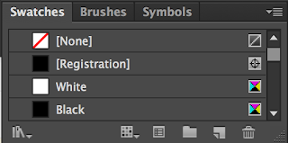
The swatch pallet is the best way to use colour.


It allows you to save colour for consistent application.

To delete unused swatches:


Then click on the bin logo.

To make viewing easier select:


It will look like the image above.

The registration swatch is for printing purposes

To create a new swatch select:


Its good practise to leave the swatch name as the CMKY values.

Process colour referees to four colour process printing.

Another way to select colour is by using the colour picker.

To edit a swatch, double click it. 


You can use the colour dropper tool to select a colour from artwork.


To add colours from artwork select:


This will add the colours to the swatches panel.


The new swatches are classed as global were as the original swatches are local.


This allows you to preview colours with the global swatch by ticking the preview box. 


With a global swatch it displays tint on the colour palette. This allows you to set up various swatches of the same ink mixture with different tint values.

This also allows you to adjust all tints with the original swatch.

Spot Colours

Spot colours are not printed using a mixture of CMYK. They are a solid colour.

Spot colours are much cheaper to use because they only use one ink.

It also allows for consistency for specific colour guidelines e.g. brand logo colour

Certain inks cannot be printed with CMYK e.g. metallics...

To acces spot colours go to:


Then go to Colour books

 Go to PANTONE solid uncoated:


To make it easier to navigate go to small list view:


To add it to the swatch pallet simply click it and it will add it to swatches.

This colour reference system only works in commercial print.


Never change the name of the spot colour!

To print tints with spot colours it uses a halftone process. The size of the dots affects the tint e.g. the smaller the dots the lighter the tint.


To save a swatch palette to use on various documents or other adobe software go to:


To open the saved swatch in new document go to:


Save the swatch in the default place. Then go to 'User defined' and select the swatch to add it to the palette. 

To export a swatch to another piece of Adobe software go to:


Save the file where you can easily find it.

To open the swatch in another Adobe programme go to the swatch menu and select 'load swatch'