Design for Print
For the brief I had to extensively research into different print processes and finishes to gain a better understanding of the techniques and options available. I quickly found out I had a limited knowledge of print and found the research beneficial to creating a book worthwhile. I had to collect primary research from the target audience to be able to make the content relevant. I should of done this towards the begging of the brief but I spent a lot of time researching the processes. I attended workshops to help me understand some of the processes because I find it easier to see the process rather than reading them. This was beneficial as it informed the concept for my book.
The initial development stages of the project took me far too long as I got myself into a bit of a rut. I had a idea in mind and was so focused on achieving it I failed to recognise I wasn't taking advantage of my strong points. I had a discussion with Phil and this helped me to realise that its ok to change an idea if its not working instead of wasting time trying to make it work. As soon as I moved onto the computer I found the initial development had helped to progress with my design and develop something I felt was much better.
The some of the production process was new to me, for example, I bound the book myself which I had never done before. I managed to achieve it but I could do it much better now I understand how it works. I bound it too tight which effected the thickness of the book once the poster were attached. I should of taken into consideration how the posters would affect the thickness of the book so I could of compensated with the bind.
Overall I am pleased with the outcome but there is a lot of room for improvement in regards to the technical aspects. Altought I have achieved what I set out to do with the content I think I could of included some more information such as finishing suggestions and stock benefits. However it was meant to be an introduction to specific print processes which I feel I have achieved.
Design for Web
I found the web brief a real challenge as I have never used dreamweaver before or have any knowledge on how a website is designed.Through attending workshops with simon I gained a better understanding of how the software works and how to prepare material ready for the web. I had to research different methods of navigation as this was something I was unaware of until this brief. I identified designs trends that are current such as flat design and continuos scrolling sites. This inspired my designs and became the focal point of design. I now know the importance of understanding the target audience and identifying the purpose of a site before starting to design.
I found the it difficult to understand how to work out the dimensions of images etc because I wasn't sure how the software worked. Through practical investigation and testing things out in dreamweaver I started to understand how the software worked. If I was to do it again I know feel confident in planning the details and dimensions before moving onto the computer. This would make the whole process much easier instead of being an exercise in trial and error which takes up a lot time.
Overall I am party pleased with the final site but I am unhappy with the workflow as it wasn't very organised.
Design for Print & Web
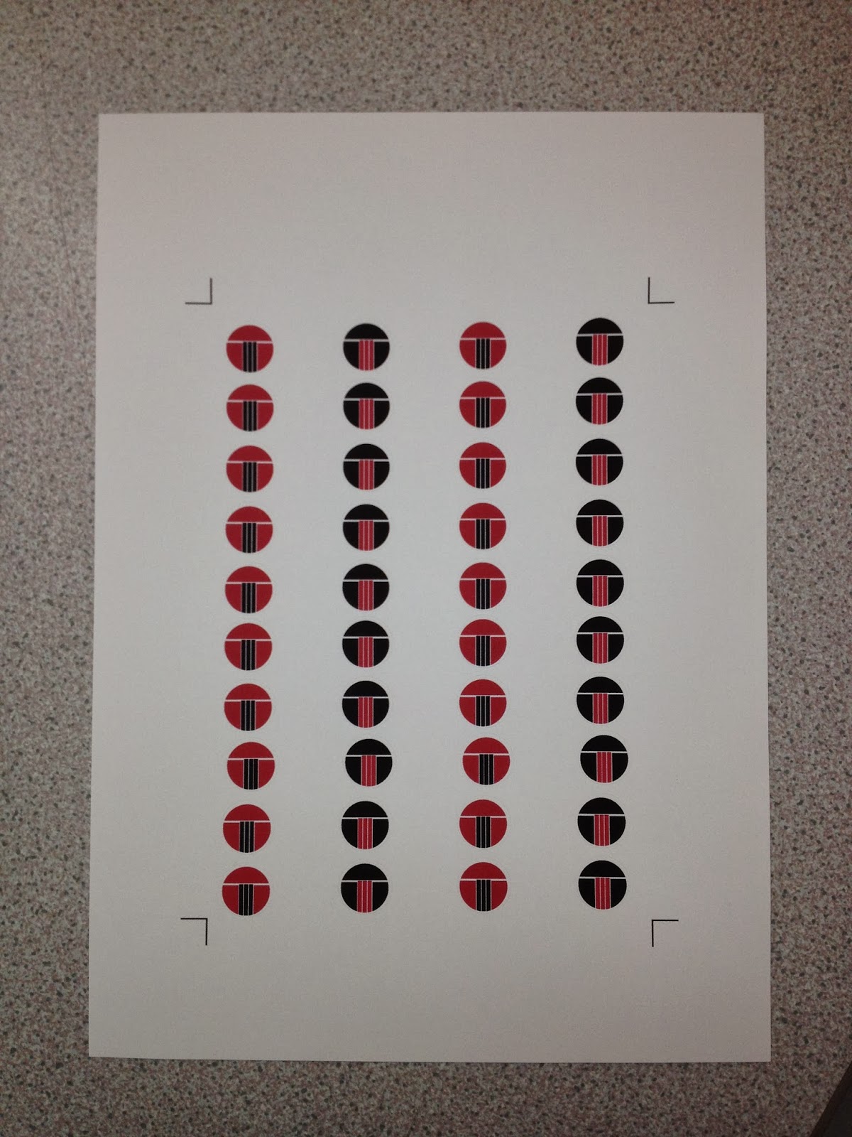
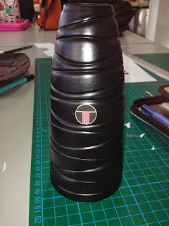
I enjoyed this brief the most which makes me think this could be something I would like to further explore throughout my career. The workshop We did to help break down the brief really helped me understand how the fine details are really important in helping to make design decisions to best design for the target audience. I had to research into branding and identity to see how a design can be transferred to a range of media to keep consistency and communicate a recognisable and familiar brand.
I found the logo to be the hardest part of the brief as the forms the basis of the whole design. Once I had achieved this I found it enjoyable seeing how I could apply this across media to create unity for it to work as a whole. I liked having the freedom to be able to propose aspects to further support the concept as a whole.
The weal points of this brief was my time management as I didn't book any print slots so I had some early mornings visiting drop in to try any get everything printed. This added to the stress but on the over hand helped to motivate me to get everything finished. However I think it is best practise to have everything planned well in advance to allow for any adjustments if things go wrong.
I photographed my work properly for this brief which I think has made a big difference in regards to presenting my work professionally, I can also use this for a portfolio piece. I am going to do this from now on with every brief to start to build up a body of work for when I leave to look for employment.
To summarise, I found it difficult to manage my time with multiple briefs going on but I feel like I am definitely improving. I still have a lot to improve on, for example my time management to allow me to get the best finish possible instead of having to rush things last minuet. I think my strong points are being able to take ideas and inspiration from sources and make them my own. Although I enjoyed some briefs more than others I still found them a good learning curve and feel I have taken a lot from this module.
1. What skills have you developed through this module and how effectively do you think you have applied them?
I have developed a range of skills throughout this module. I have learnt how to break down a brief and reconstruct it to help design to a target audience. I have learnt a range of practical skills such as bookbinding, photographing work and craftsmanship. I know understand how to use Dreamweaver and how to prepare work for designing for web. I have applied theses skills across the three briefs appropriately.
2. What approaches to/methods of design production have you developed and how have they informed your design development process?
I have realised how to fulfil a brief by analysing it and breaking it down to fully understand the audience. This is the main factor that had informed my design decisions throughout this module.
3. What strengths can you identify in your work and how have/will you capitalise on these?
The main strengths in my work are being able to take information and communicate it simply and directly to fulfil the purpose. I think I am getting better at keeping consistency across designs to create a though out design.
4. What weaknesses can you identify in your work and how will you address these in the future?
I think the main weakness in my work is the generation of primary research. I found it really difficult to think of different methods of collecting and I generally lack confidence when it comes to talking to people, for example, in the street. I find it quite difficult to organise my findings into a clear, functional manor. To address this I will need to get more confident in approaching people and asking questions to gain a better understanding, which could then inform the methods of generation of research.
5. Identify five things that you will do differently next time and what do you expect to gain from doing these?
· Collect a broader range of primary research
I expect to gain a better understanding of my subject matter, which will inform my design decisions. This is becoming more relevant as the briefs are for a specific audience. It will inform the content and turn a project into something informed rather than designer based.
· Ask for more feedback from my peers
Asking a larger amount of people can give a variety of different perspectives and ideas/issues that I might not of thought of on my own.
· Think about the deliverables more in-depth
I need to spend a little more time thinking about the deliverables and what I need to do before making design decision, to allow me to explore the possibilities to fully fulfil the brief.
· Better organisation in regards to time scales
My time keeping has been terrible in this module. I need to be organised and plan my time much better so I can spend the right amount of time on certain things to get the best outcome. I need to book slots for printing and photographing well in advance to help remove some of the pressure.
· Take advantage of the facilities more
I tend to sky away from the using the facilities at college because I enjoy working digitally. I think I should try to be more open minded about this as it could make my work one dimensional and static if I’m not careful.


