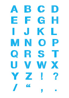
For this brief I am required to produce an alphabet based on one of the letterforms from the Alphabet soup brief.
In this session Simon introduced us to Illustrator. He started off by explaining the different settings when opening a new document in illustrator. For example, the difference between CMYK and RGB.
He then went on to set us two task to complete.
Task 1
Pen tool Exercise
I had to complete seven exercises that focus on the use of the pen tool. Even though I know how to use the pen tool I still enjoyed this task because it refreshed a few techniques I had forgotten about. I completed the task without any issues.
Task 2
Vector Letterforms
For this task I had to use the pen tool to create a vector version of this this hand drawn letterform.
This is how it looked. The right letterform is my first attempt utilising the techniques from the previous task. The left letterform is after using the direct selection tool to refine the overall look.
Pathfinder
For this exercise I recreated the letterform from the previous task, but instead of using the pen tool, I created it by using the ellipse tool. I layered the shapes and used the pathfinder to either minus the front shape or combine shapes. This method is really useful to know because it allows you design the same thing a lot faster.
Creating Outlines
In this exercise I was taught how to manipulate an existing typeface. To do this I had to convert the letterforms into outlines to allow me to adjust the points with the direct selection tool. This will be useful when I design my own typefaces for commercial work, giving me a starting point to design from.
Strokes
In this exercise I learned how to use the width tool to adjust the weight of strokes and shapes. This tool is really fun to use and will be useful when creating illustrations.
In this exercise I learned how to create two styles using the same tool. They are both created using the blend tool. The top image was created by drawing two shapes, double clicking the blend tool and selecting 'Specified Steps'. For it to work you hover the cursor over a corner on each shape and click. The bottom image was created in the same way apart from giving the shapes a colour fill and selecting 'Smooth Colour' in the blend options.
Development
For the original brief I was given the word 'Layer' to visually communicate through the letterforms. My initial idea was to combine different weights of a typeface to represent the layers from a warped perspective.
To create my alphabet I used three fonts from the Helvetica Neue typeface.
- Ultra light
- Medium
- Bold
To start I turned the letterforms into outlines and layered the fonts from left to right, thickest to thinest.
To finish I filled the body in black with a white outline to clearly define the layers.
Colour Schemes


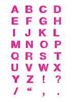
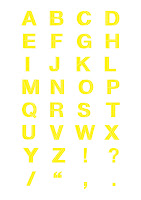
I wanted to see what it would look like in different colours so I used CMYK to test it out. I like cyan the best because it looks clean and fresh displayed on the white background.
I started to experiment with different perspective. In the example above I simply moved the bold letterform slightly down and to the right to create a suspended look. I think this technique because it adds depth to the letterforms, however I feel it loses visual quality overall.
In the example below I shifted the bold letterforms significantly to the right. I don't think this style is appropriate because it decreases legibility.
Next I experimented with opacity, changing the medium letterforms to 50% opacity.
To further explore opacity settings I changed the bold letterforms to 70% opacity. I think this technique is effective in defining the levels and creating depth to successfully communicate layers.
This is my final design with colour and different opacity settings. I changed the medium and bold letterforms to 70% opacity because I felt it was more subtle and created a nice perspective making the letters come out of the page or sink into the page depending on how you look at it.


No comments:
Post a Comment