Below are my initial sketches and ideas for my mail shot.
I started by thinking about designing a pull out in the shape of a nuclear symbol. The idea was to have flaps that fold out with information underneath.
This is a mock up to see how it would work.
I found that I would have to fold it in half for it to fit into the envelope which I felt would compromise the design.
I decided to leave this idea because I felt it would be too small to fit all the information on without it looking cramped.
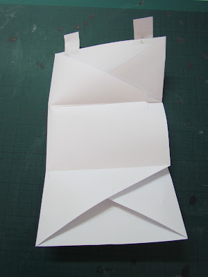
I revisited my initial ideas and decided to develop this one. The idea is to have the envelope and the mail shot all in one piece. I designed it to fold out which will allow me to fit the information on in a more efficient way.
This is a mock up I made just to make sure it would work before developing it further.
I designed flaps on the top to secure it so it can be opened up without being ripped by glue.
Digital development
Now I have decided on my design I have started to develop it digitally. I started off by making the net for the mail shot.
The width of the mail shot is 66cm so I had to make it A1 for it to fit.
Inside of the mail shot
Next i started adding text. I changed the text from my poster to make it more clear what the message is about, as that was one of the points made from the poster crit. I used the same font to keep continuity across the media.
On the side sections I wanted to add some off the endangered species documented in Chernobyl to make it more clear what the message is. I found images of the animals and edited them in photoshop first. I changed the threshold to achieve a stencil look.
Finally I opened it in illustrator and live traced the image. This created a nice clean vector finish which I felt was appropriate for the overall style.
The two images below is how it looks with all the animal images completed.
This is the design with all the elements added. Im pleased with the outcome so far.
Outside of the mailshot
The triangle at the bottom is meant to subtly represent the nuclear symbol.
After I finished my designs I went to inquire about printing and discovered that you cant print double sided on A1. This meant I had to alter the dimensions of my design. To overcome the problem I reduced the size of the side sections to allow it to fit on A2.
Final Design
Inside
Outside
Next I started sketching some ideas for the mailing list.
This was my first digital design. I decided it had too much going on and needed to be simplified. Also I didn't add the addresses of the companies I chose to send it to so I developed it further.
Final mailing list design
Final Product


No comments:
Post a Comment