Initial Ideas
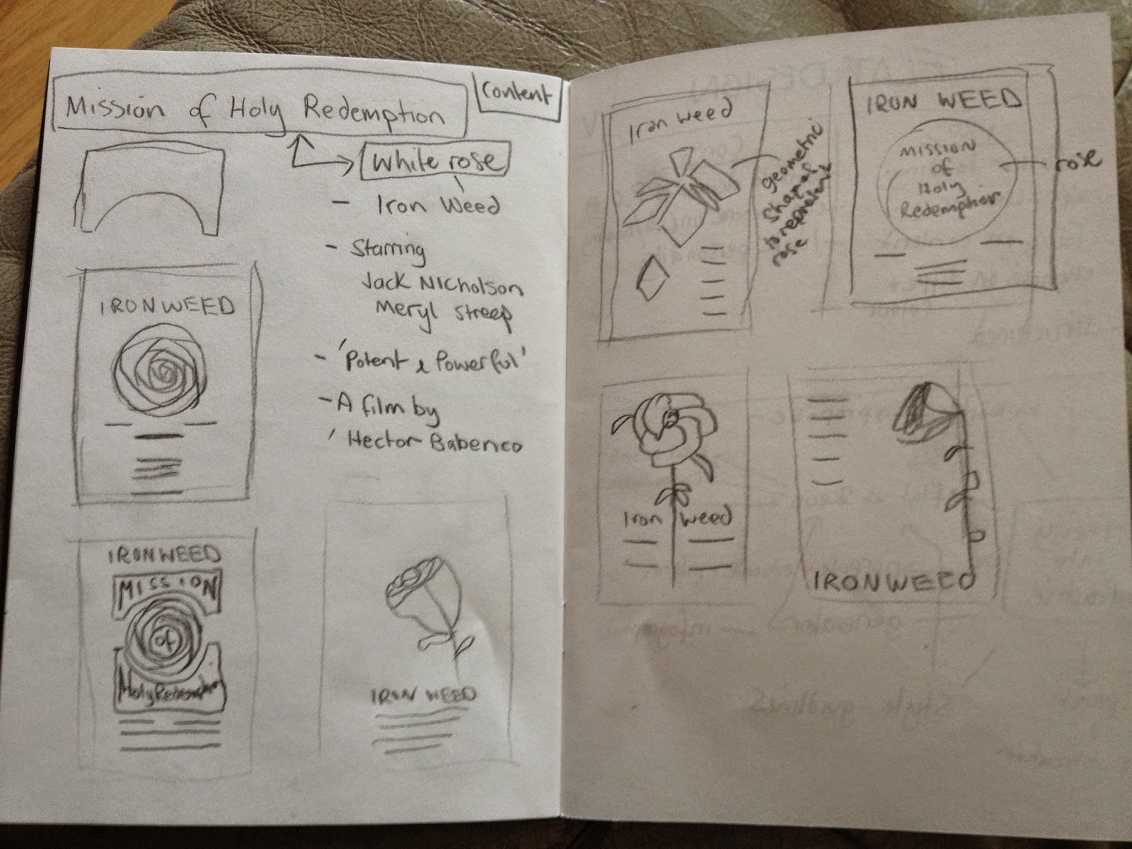
In this scene Jack Nicholson gives Meryl Streep a white rose before she performs a song about their friendships. This scene is iconic so I am going to use the white rose to represent the troubles of his past and how their friendship is something good to come from it.
I sketched out a few ideas to get a rough idea of layout and how best to use the type with illustration. I want the rose to be the main focus so I think having it centred will be the most appropriate.
Font
Market Deco
I chose to use this font because I felt it reflected the setting of the film and the time it was produced.
Colour Scheme
Red and black will be the main colours with white being the stock colour.
Digital Development
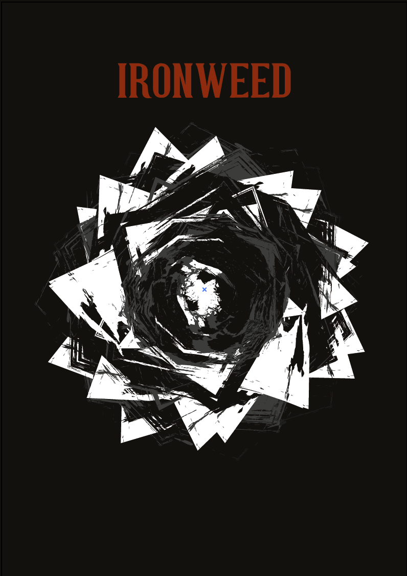
I started off by making the structure for the rose. I did this using different shapes and rotating them 360 degrees.
I made duplicates of the rose to try out different brush finishes to soften the harsh vector lines. I am going to layer the different finishes with varied opacities.
I layered up two of the roses and tried a font similar to the original poster to to see if it would be more appropriate than the one I originally chose. However, I don't think it communicates an alternative poster so I am going to stick the my first thought.
Next I tried a different approach by keeping the rose geometrical and with the different font. I am going to keep the typographic content to a minimum to allow the rose to draw focus.
I wanted to see what different colour ways would work best. I like having the type in different colours, I think it helps to break up the information giving clarity.
I felt the rose was too conceptual so I added some detail to make it clearer to what it is.
After some reflection I think the minimal geometrical theme doesn't represent the film in the way I am wanting to communicate so I am going to re-think my design.
I wanted to reflect the movie better so I started again with the illustrations. I want to create a posterised feel by using brushes and different opacities.
In the film, the two characters are alcoholics so I wanted to represent this in the design. I created a swirling circle around the rose to represent this.
To further clarify the type I changed the outlines and underlined the director name with red to relate to the film title and actors.
To finish off the poster I applied the upper arch warp to the title to follow the circle and create depth.
Final Design
I am really pleased with the outcome and feel its a good representation of the film as a whole. It looks like I have used more than two colours but its just different opacities which I think has worked well to not create a static image by creating depth.


No comments:
Post a Comment