- The ability to construct meanings from visual images and type.
- Interpreting images from the present, past and a range of cultures.
- Producing images that effectively communicate a message to an audience.
Visual Communication
- A process of sending and receiving messages using type and image.
- Based on a level of shared understanding of signs, symbols, gestures and objects.
- Affected by audience, content, media and method of distribution.
Semiotics
Sign
Symbol
Signifier
Key elements of Graphic Design
- Frame
- Format
- Figure/ Form
- Ground
- Visual Dynamics
- Type
- Image
- Colour
- Layout
- Legibility
- Readability
We were then set a task of identifying five fonts with fundamentally different characteristics.
1. Colona MT
This is a serif type that has negative space running through each letterform that splits the letters into sections, generally consisting of two to three parts. I'm not a massive fan of this typeface because it strains my eyes and looks a little blurry after looking at it for to long.
I think this type is a sans-serif typeface. However it has spurs on certain letterforms that resemble serifs. I think this is because it looks like a hand written style type with a natural free flowing stroke that varies in width. The legibility isn't too bad on the uppercase but the lowercase is a lot more difficult to read because the letters join up.
3. Futura
This typeface has some distinctive features. For example, the lowercase has unusually tall ascenders. The uppercase letters has really sharp features, particularly on letters M, A, N, W. I like the uppercase letterforms in this font but the ascenders of the lowercase, to me, stick out and look unnatural.
4. OCR A std
This type has a retro feel to it. It looks like its made up of pixels and reminds me of an old computer start up screen. Different to Futura, it has a high x-height. This makes the ascenders look short and stubby. Finally it has serifs, only on certain letters which is unusual.
5. Rockwell
This is a bold, masculine looking typeface. It heavily features slab serifs which adds to the masculinity. This typeface is clear, straight to the point with good legibility which I think is the purpose.
Anatomy of type
Part 1
What is typography?
- The art and technique of printing with moveable type
- The composition of printed material from moveable type
Form and function in typography
We were asked to get into groups and arrange the five fonts we brought in from the previous task into five categories we felt appropriate. My groups were as follows:
- Serif
- San-serif
- Blackletter
- Script
- Graphic
After a class discussion we found that two of our categories (Graphic,Blackletter) didn't relate to the fonts.
We were then asked to rearrange them into the following categories of method of production:
- Stone
- Sable
- Bone
- Wood
- Lead
- Silicon
We were asked to describe the characteristics of the font on the top of each pile.
We went round the class and shared answers to collate a list of characteristics.
Method of Production Character of Letterform
Stone Classic Established, Sophisticated, Traditional, Commercial, Rough, Fast,
Sable Pre Fluid, Gothic, Elegant, Feminine, Posh, Modern, Curved
Bone Industrial
Wood Modern Simple, Formal, Curved, Modern, Fragile, Rounded, Bold, Minimal,
Lead Post Geometric, Dense, Textured, Simple
Silicone Industrial
Anatomy of the Glyph
- Bold
- Serif
- Light
- Regular
- Weight
- Stroke
Point size
1 point = 1/72 inches = 25.4/72 mm = 0.3527
12 points = 1 pica
To finish the session, we collected the fonts we had brought in and swapped them with someone in the class. We were asked to find out the names of each font, focussing on one fonts every detail.
Task
1.
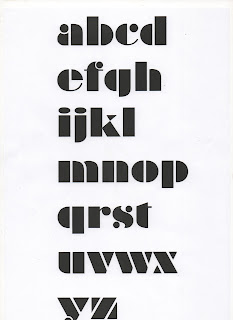
Braggadocio
Braggadocio (typeface)
Braggadocio is a geometrically constructed sans-serif stencil typeface designed by
W.A. Woolley in 1930 for the Monotype Corporation.
The design was based on Futura Black.[1]
Though a stencil face, Braggadocio bears comparison with the heavier
weighted Didone faces like Thorogood, Poster Bodonii, and Fat Face.
A product of the Art Deco era, Braggadocio shares similarities with Architype Albers and Futura Black,
the typeface used in the wordmark of Au Bon Pain, a U.S. restaurant-bakery chain.
The lowercase characters a, f, c, s and y have terminals similar to the Fat Face model.
The face is atypical in a topological sense in that none of the characters has a circular counter-form (hole).
http://en.wikipedia.org/wiki/Braggadocio_(typeface)
Glyphs- 253
Buy from:
Myfonts 26/29$
Linotype library £29.75
Ascender fonts 29$
Font shop 29$
Fonts 29$
Edwardian Script ITC
Bernard MT Condensed
Colona MT
5.
Courier New
Anatomy of type: Part 3
Type and character
To start the lesson we got into the same groups as last week and discussed the font we had chose to research.
"Type is speech made visible"
Vocabulary- elements within type families
- Font
- Typeface
- Font family
- Weight
- Stroke
- Uppercase
- Lowercase
- Tracking
- Kerning
- Serif
- Sans-serif
- Script
- Blackletter
- Display
- Monotype
- Symbol
•TYPEFACE
A collection of characters, letters,
numbers, symbols, punctuation etc. which have the
same distinct design
•FONT
The physical means used to create a
typeface, be it computer code, lithographic film,
metal or woodcut
4 Key Fonts
Block- display header
Gothic- Simplicity
Roman- Standard serif font
Script- Brush, handwritten
7 fonts make up a typeface
Gill Sans
For the first task we were asked to categorise are fonts into the groups:
light/ italic
regular/ italic
bold/ italic
ultrabold condensed
We categorised our font into regular, bold and regular italic.
Then we caregorised them into block, gothic, roman and script.
Legibility & Readability
Part4
Legibility
Legibility is the degree to which glyphs (individual characters) in text are understandable or recognizable based on appearance.
Readability
Readability is the ease in which text can be read and understood. It is influenced by line length, primary and secondary leading, justification, typestyle, kerning, tracking, point size etc.
Leading
Leading is the space between each glyph
Tracking
Tracking is increasing the leading
Kerning
Decreasing the leading
No more than 3 fonts from 3 typefaces
Task
For this task we asked to identify the full typeface for the 5 fonts from the first task set.
Colonna MT
- regular
Mistral
- regular
- medium
- medium italic
- condensed medium
- condensed extrabold
OCR A std
- regular
Rockwell
- regular
- italic
- bold
- bold italic
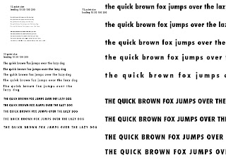
We are required to identify the most readable font from each typeface and display with
'The quick brown fox jumps over the lazy dog.'
'The quick brown fox jumps over the lazy dog.'
Colonna MT
- regular
The most readable was medium, 72 point size, 100 tracking
Mistral
- regular
Futura
- medium
- medium italic
- condensed medium
- condensed extrabold
The most readable was medium, 32 point size
Rockwell
- regular
- italic
- bold
- bold italic
The second part of the task was to identify 4 fonts in the categories block, gothic, roman and script and display the letters a,b,c in upper/lowercase.
Script
Roman
Gothic
Block
For the first part of the lesson we had to display on wall the five most readable fonts we were asked to bring in from the last session.
What effects readability
What effects readability
- Line length - easier to read if the copy is on one line
- Scale - the format effects the readability due to the line length
- Number of words - especially effects script font because its designed for headlines.
- Viewing distance - the distance that the text is viewed from can effect the readability. Sometimes best to view from a distance.
Next we had a presentation on part five of the anatomy of type ' Type as Image.'
STUDY TASK 2 - The Birth of a Font
In this session were had to cut out the upper/lowercase letters 'a, b' from our chosen fonts (Gothic, Roman, Script, Block). We had to cut the letterforms into their individual anatomical elements:
A
- stem x2
- crossbar
a
- bowl
- stem
B
- stem
- bowl x2
b
- stem
- bowl
Helvetica
Light
Regular
Bold
STUDY TASK 3 - Speech Made Visible
Visual literacy: The language of graphic design
"Work the metaphor. Every object has the capacity to stand for something other than what is apparent. Work on what it stands for."
Visual Metaphor
Visual metaphor is used to transfer meaning from one image to another. Although the images may have no close relationship, a metaphor conveys an impression about something relatively unfamiliar by drawing a comparison between it and something familiar.
Visual synecodoche
The term is applied when a part is used to represent the whole, or vice versa.
Visual Metonym
A symbolic image that is used to make reference to something with a more literal meaning.
In trying to separate words from pictures we have to accept that words are 'pictures of letters'
If you cant make it good make it BIG
If you cant make it big make it red
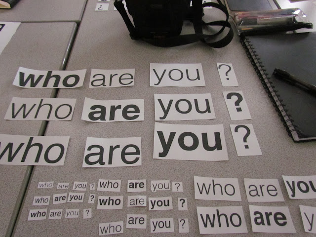
After the presentation we had to get out the phrase we were asked to bring in:
'who are you?'.
We got into groups and started by rearranging different words in the different weight groups. We then had to go through each phrase reading what we saw, focusing on emphasis. It was actually quite difficult to vocalise clearly and fluidly.
Finally we had to think of three different variations of the phrase and vocalise it to the group, who had to visualise it using the different weights and sizes to reflect the volume, emphasis and pace.
Accents studio session
In todays lesson we looked at the accents that we had to bring in from task 3.
We got into groups and put all our accents into one pile and moved to next table.
We had to arrange them piles that we thought were the right accents
- Scottish
- South African
- Italian
- Texan
- Mexican
- Somerset
- Birmingham
- Cockney
- German
- Chinese
- Swedish
The whole group found this really difficult because some of the accents were represented by the size and weight of a font. This meant it could be interoperated in lots of ways depending on how its read. For example Birmingham and Somerset.
We then had to choose three that we felt we had successfully identified and wright on the back. We went back to our original table and put the accents back into the right piles from the start. We went round the class reading out the results and discovered that no group had got a complete pile right. The class as a hole struggled with regional accents because, unlike some of the foreign accents, they didnt have any stereotypical fonts to represent them.
This was interesting because the fonts used to represent the foreign accents were really bad and wouldn't be used in professional design work. This made me realise how difficult and important it is to choose the right font or typeface to portray a specific message.


No comments:
Post a Comment