Formed by the juxtaposition of light and dark values. This could be monochromatic. (One colour)
Blue has the darkest contrast, red has a mid contrast and yellow has the brightest contrast of tone.
Blue and yellow have a high contrast between each other because they are at the opposite ends of the tonal spectrum.
Blue and violet have dark tonal values, this means there is a low contrast between the two.
Green and orange have similar tonal values on the colour wheel. Green should be slightly lighter but appears darker in my experiment. I think this must be down to the shade of green used.
I tried two shades of orange which are both a mid tones. This makes the object blend in to the background, making it less legible.
For maximum impact it is best to display high contrasts of tone. For example, the blue lighter stands out more on the yellow background than the orange because they have a high contrast of tone.
• Contrast of HUE
Formed by the juxtaposing of different hues. The greater the distance between hues on a colour wheel, the greater the contrast.
I have used Violet to demonstrate the differences in contrast of hues.
Yellow is the furthest away to violet on the colour wheel which means it has the highest contrast.
Red-violet and blue-violet are the closet to violet on the colour wheel meaning they have the lowest contrast.
Blue-green and red-orange are in the middle on the colour wheel, this means they are of mid contrast.
Yellow-green and yellow-orange have the second highest contrast because they are adjacent to yellow on the colour wheel.
Violet is a secondary colour that is made from the primary colours blue and red. They are of equal distance on the colour wheel in relation to violet making them a low contrast.
• Contrast of SATURATION
Formed by the juxtaposition of light and dark values and their relative saturations.
The blue on the right is the pure colour, the blue in the middle is the shade and the blue on the left is the tint.
I repeated the process with different colours to see the saturation. The objects on the right are the pure colours, the left the shade and the backdrop are the tints. I think its clear to see how the addition of black and white affects the desaturation of the colours.
• Contrast of EXSTENSION
Formed by assigning proportional field sizes in relation to the visual weight of a colour. Also known as the contrast of proportion.
I tried different complimentary colours to see the contrast and how they become balanced depending on the proportions.
With balanced proportions I don't think the colours have much impact.
With more orange the colours look unbalanced.
With more blue the colours look harmonious and balanced. This would be useful to achieve hierarchy to draw the eye to a specific area.
With similar proportions the colours look static but varying them creates a more interesting manipulation of contrast.
Similar to the orange and blue, the proportions affect the balance and contrast. Because the violet is heavier in weight, I think it would work better the other way round.
• Contrast of TEMPERATURE
Formed by juxtaposing hues that can be considered ‘warm’ or ‘cool’. Also known as the contrast of warm and cool.
Warm colors are vivid and energetic, and tend to advance in space.
Cool colors give an impression of calm, and create a soothing impression.
White, black and gray are considered to be neutral.
Warm Colours
Cold Colours
Blue considered as a cold colour and orange as warm colour, this creates a high contrast of temperature. They are also complimentary colours which are the furtherest apart on the colour wheel.
Both of the images above are of a low contrast of temperature because they are from the same temperature group.
I wanted to see if the saturation of the colour would affect the temperature. After observing, I don't think it affects the temperature because they are still warm colours. However, the saturation effects the light and dark values of the colours.
Next I placed cold colours onto a warm background to see what happened. The objects with darker tones seem to become cooler in temperature.
Finally I placed the warmest, against the coolest colours to see the high contrast. I placed opposite colour temperatures in order of tone; dark on light and light on dark. This confirms that the light and dark values of a hue can appear to exaggerate the temperature of a colour.
• COMPLEMENTARY contrast
Formed by juxtaposing complementary colours from a colour wheel or perceptual opposites. Complimentary colours cancel out each others hue to produce an achromatic light mixture (white, grey,black).
Colours that appear together will be altered as if mixed with the complimentary colour of the other colour. The mixture of the two is predicted by the straight line between them. For example, in the image above, if red was placed on blue, it would project an orange tint.
I chose a yellow object to conduct my experiments with.
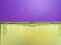
Yellow on blue creates an orange tint.
Yellow on red creates a green tint.
Yellow on green creates a red tint.
Yellow on orange creates a blue tint
Yellow on violet cancels each other out and should produce an achromatic light mixture.
This made me wonder what would happen when placed on grey, white and black. I initially thought I would see its complimentary colour.
When placed on grey I can see the yellows complimentary colour (Violet).
When placed on white I can see a black tint.
When placed on black its the opposite and I can see a white tint.
I tried it on a multicoloured background to see what would happen. I think because there is so much going on in the background, my eyes are constantly adjusting and cannot distinguish the changes if there are any.
• SIMULTANEOUS contrast
Formed when boundaries between colours perceptually vibrate.
Viewing two colors at the same time influences both of their appearances.
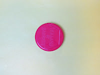
The red cap appears to take on different characteristics depending on its surroundings. For example, on a white background, the red looks dull and lifeless but on the black background, its vibrant and warm.
Next I tried it with red and green which are complimentary colours to see if the boundaries would perceptually vibrate. I don't think it worked to well because of the thickness of the stripes. However I think the cross hatched works much better to visualise the contrast.
• Colour HARMONIES
Analogous color scheme
Analogous colour schemes use colours that are next to each other on the colour wheel. They usually match well and create serene and comfortable designs.
Analogous colour schemes are often found in nature and are harmonious and pleasing to the eye.
Make sure you have enough contrast when choosing an analogous colour scheme.
Choose one colour to dominate, a second to support. The third colour is used (along with black, white or gray) as an accent.
Green, yellow-green, blue-green
Red, red-violet, red-orange
Triadic color scheme
A triadic colour scheme uses colours that are evenly spaced around the colour wheel.
Triadic colour schemes tend to be quite vibrant, even if you use pale or unsaturated versions of your hues.
To use a triadic harmony successfully, the colours should be carefully balanced - let one colour dominate and use the two others for accent.
Orange, violet, green
Blue, yellow, red
Split-Complementary color scheme
In addition to the base colour, it uses the two colours adjacent to its complement.
This colour scheme has a strong visual contrast, but has less tension than complimentary colours.
The split-complimentary colour scheme is often a good choice for beginners, because it is difficult to mess up.
Green, red-violet, red-orange
Yellow, blue-violet, red-violet
Rectangle (tetradic) color scheme
The rectangle or tetradic colour scheme uses four colours arranged into two complementary pairs.
This rich colour scheme offers plenty of possibilities for variation.
Tetradic colour schemes works best if you let one colour be dominant.
You should also pay attention to the balance between warm and cool colours in your design.
Orange, green, red, blue
Blue, green, red, orange
The square colour scheme is similar to the rectangle, but with all four colours spaced evenly around the colour circle.
Square colour schemes works best if you let one colour be dominant.
You should also pay attention to the balance between warm and cool colours in your design.
Blue-violet, yellow-orange, red, green
Blue-green, red-orange, violet, yellow
Natural Light
I photographed the yellow object every two hours starting at 12 noon, up until 10pm. I wanted to see how the change in light affected the colour.
12.00am
2.00pm
4.00pm
6.00pm
Up until 6pm the yellow has a slight orange tinge but at 6pm it starts to look cooler.
8.00pm
As the light decreases the colour shows a blue tinge surrounding the yellow and the yellow itself has a lighter tint. This has affected the contrast of saturation. It looks like a lighter tint of yellow.
10.00pm
As the light nearly disappears the colour becomes desaturated again. However this time is affects the shade of yellow.
Artificial Light
After experimenting with natural light I photographed the same object under different coloured artificial lights to see if it affected the colour.
This was taken with the flash from the camera. I can see a slight blue tint to it.
This was taken under a yellow light. It has a slight orange tint to it.
This was taken under a red light and has a strong orange tint.
This was taken under and green light and I can see a slight blue tint.
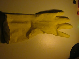
Finally It was taken under an orange light and I can see a very slight tint of violet.


