Wednesday, 27 February 2013

OUGD406- Communication is a Virus- Individual work

Now we have our concept in place we have assigned each other roles to complete individually. I am going to design posters for the campaign.

As a group, we discussed what the mandatories are and decided the posters need to display:

  • Blog address- yourtea.wordpress.com
  • Email address- yourteablog@gmail.com
  • Twitter name- @yourteablog
Another point raised in the discussion was that not every one has access to the internet so the idea of creating an interactive poster was suggested as another means of recording if people are getting involved. We could then include this data on our blog as well.

Background considerations

I will need to consider where would be best to display the posters for them to be most effective.


I found an independent tea company situated in Leeds and have sent an email asking if they would be interested in letting us display our printed promotional material in their shop. If they are willing to help then this will be great for us to target the real tea drinkers that are more likely to get involved with our blog.


I haven't had a response from the company so we are going to go visit shops to see if they will let us display some posters so we can reach a wider audience, rather than just college.


Initial ideas

Poster Thumbnails


Interactive Poster


As we discussed, not every one has access to the internet so the idea for the interactive poster is to stick a sticker on your preferred tea. This will allow us to record data that we can later add to the blog.


Promotional Material 


As a group we chose 4 posters and one interactive poster to develop further:


We decided to have two typographic posters for maximum impact, and two with type and image to catch the viewers attention.


This is the logo for the blog that Priyesh designed and the rest of the group have design a font made from tea. These two elements are going to feature across our media for continuity.


We decided on a colour scheme:

Mint Green

C- 50
M- 0
Y- 35
K- 0

Brown

C- 70
M- 90
Y- 100
K- 30


I tried the tea font with flat colour. I prefer this look to the photographed and I think it will work better on the posters. 


I experimented with reversing the colours, use of font and size and placement of the logo. I have designed some variations, so as a group on Monday we can chooses the strongest and develop them further if needed.


Digital Development

Poster 1


Poster 2


Poster 3


Poster 4


Interactive Poster


Stickers and Sticker Box


Final Designs

I showed the group what I had done today and we decided on these designs for the final outcome.


We have displayed the poster series in various places around college where we felt would get the most exposure. We have also put some up in cafes in town to reach a wider audience.

We have got permission to display the interactive poster in the cafe at college. We want to put it somewhere where it will get the most attention, preferably near where the tea is sold.


Video Editing

We recorded a viral add to go onto the blog and twitter page. Danielle came up for the concept and the group pitched in to help film it. The video was passed over to me to edit. I have edited with Adobe after affects which was a challenge because I have never used it before. We have organised to get it played on the T.V. in the cafe at college which will be great exposure as lots of people eat and drink tea in there. 


Now the video is finished I have uploaded it to youtube and posted it to our twitter page. This is another means of distribution as people can leave comments on the page.


Interactive Poster

We displayed the interactive poster in the cafe at college. The results were more successful than we anticipated which was great. I think this was due to the simplicity and ease of participating.


Thursday, 21 February 2013

OUGD406- Communication is a Virus- Group work

Group 6 

Danielle, Kirsty, Sophie, Priyesh, Jane and myself was given the topic:

Drink Tea


We had a discusion and decided to create a brand of tea that allows the customer to mix and match different flavours to make their own personalised flavour.

We identified 6 key areas to start and delegated each area to start researching

Distribution channels (James): 
How will we get people to talk about us, spread the word 

Packaging (Danielle):
What kind of packaging will we provide for people to bring their loose tea home in
cups, mugs for drinking in?

Tea room layout (Sophie):
How will we display the "blend your own tea area" within the tea room and how do we communicate the message?

Products: Tea Flavours and health benefits from drinking the tea (Kirsty):
Research flavours that we should include and find out about the benefits from drinking it.
Think about how they could be illustrated.
Food that complements the different tea flavours.

Branding & Identity (Priyesh):
Name, Logo, colour schemes

Promotional (Jane):
Reward or loyalty scheme to keep customers coming back
Any other promotional activities to raise awareness. 


From the presentation with Amber and Simon we found we had gone off course with our proposal because the next stage of the brief is to fulfil what we had proposed. With this in mind we had to take a step back and re-think the direction. We decided to stick with the original concept of people's personalised tea but in the format of a blog.

we now have the following details in place:


After the second crit with Amber we decided on our concept and delegated jobs out for each of us to complete:

James: Posters
Logo: Priyesh
Kirsty: Complimentary food for tea/tea flavours
Danielle/Sophie: How to make your own teabags etc.
Jane: Ideas for articles, information, advice, recommendations etc for blog


Groups Work

Blog Page

Priyesh created the blog page for the group and added all the content. 


Twitter Page

Kirsty set up the twitter page which we all contributed to by posting different things relating to tea and to the blog.


Youtube Page

I created the youtube page for the video we made, this was linked to the blog and twitter page and also had the option for people to leave comments.


Viral Video Add

Danielle came up with the concept for the video and the group helped to film it. I finished it off by editing it in After affects.


Polls

We had a variety of polls featuring on our blog that people could vote for.


Tea Font


Kirsty designed a font made from tea for us to use across the media to keep continuity.


Logo

Priyesh designed the logo which featured across all our media.


Leaflets 

Priyesh also created some flyers to work along side the posters. We printed these in black and white to keep costs down and to allow us to print a large amount to display in more places.


Stickers 

I came up with the idea to create a gorilla advertisement and Priyesh designed it to work with the logo. 


Twitter Promotional Leaflet 

Jane designed these leaflets that had a free teabag inside. The idea was to get people to guess what flavour the tea was and tweet the answer to our Twitter page.


Wednesday, 20 February 2013

OUGD406- Communication is a virus- Concept

Concept:

To create a blog supported by social media that will promote the benefits of tea and create a discussion forum amongst tea drinkers.

Driven by printed promotional material that will direct people to the blog/social medias.


What do you want to say?


We want to make people aware of the benefits of tea and create a social forum where people can share and discuss their tea experiences.


How do you intend to say it?

By offering advice, hints, share experiences, recommendations


What language would be appropriate?

We want to communicate a vibrant and welcoming atmosphere through the use of informal and friendly language.


Will the content communicated primarily through type or image?

We will use both type and image. Due to the limited colour palette the type will have to compliment the images to communicate our message.


What are you aiming to achieve?

We want people to share experiences and advice, create a forum that where like minded t
ea drinkers can chat and enjoy being part of an online community.


After we decided on our concept we had to write our own brief stating what we were aiming to achieve:

Group Brief

Monday, 18 February 2013

OUGD406- Workshop Brief: Indesign (Hedgehog) Double page spread

Double page spread  
(Hedgehog)

For this brief I am required to design a double page spread based upon the subject matter, 'Hedgehog.' The article must have 500 words and contain at least three images.

Thumbnails 


Illustration

I created some simple illustrations in illustrator to work along side the type and images. 


Layout Experiments

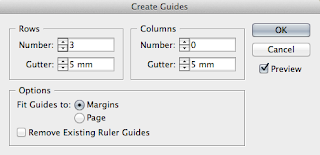
I set up my document with a three column grid and three rows of guides to break it down into nine sections.


I think the two designs above look a bit to formal and too structured for the age group I am aiming it at. I asked some of my peers and they agreed so I decided to leave out the large image of the hedgehog and focus more on the illustration.


I still think this design looks too structured with the columns of text.


I tried a more free-flowing layout which I think works much better as children's magazines jump from one section to the next in an unorthodox way.


After working more with grids in my design principle lessons, I tried using an 8 field grid as it allows for more variations. I much prefer this grid system.


I kept experimenting with the layout because I wasn't happy with the balance between the images and text.


Final Design


This is my final layout. Im happy with the balance now, between the images and the text.