(Hedgehog)
For this brief I am required to design a double page spread based upon the subject matter, 'Hedgehog.' The article must have 500 words and contain at least three images.
Thumbnails


Illustration
I created some simple illustrations in illustrator to work along side the type and images.

Layout Experiments
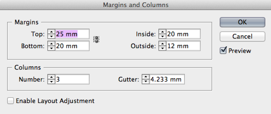
I set up my document with a three column grid and three rows of guides to break it down into nine sections.


I think the two designs above look a bit to formal and too structured for the age group I am aiming it at. I asked some of my peers and they agreed so I decided to leave out the large image of the hedgehog and focus more on the illustration.

I still think this design looks too structured with the columns of text.

I tried a more free-flowing layout which I think works much better as children's magazines jump from one section to the next in an unorthodox way.

After working more with grids in my design principle lessons, I tried using an 8 field grid as it allows for more variations. I much prefer this grid system.

I kept experimenting with the layout because I wasn't happy with the balance between the images and text.

Final Design
.jpg)
This is my final layout. Im happy with the balance now, between the images and the text.
No comments:
Post a Comment