From the studio workshops, I started by making a mind map to get everything out of my head and onto paper.
This helped me to gain a better understanding of the content and how it would be distributed across the five pages. I want the home page to have minimal information and mainly links to lead onto the body's of information.
I have broken it down into four main categories/pages:
-History
-Gestalt principles
-Figure-ground perception
-Examples of design
Creating the flow chart helped me to understand how my website will navigate. The homepage will link to each page and the four pages will need to link back to the homepage as well as each other to allow for easy navigation.
Website Content
I wrote down a rough version of the content to help me gain a better idea of how I could lay it out when I come to designing.
Home Page
From the research I have collected on navigation I found that one page sites with continuous strolling are on tend at the minuet so I thought about how I could apply this to me design. After some though, I don't think this method is appropriate for the homepage because it doesn't fulfil the brief because the homepage needs to have links to other pages.
History Page
This will be the first page of my site. It will have some information on what the subject is about with accompanying illustrations. I think the continuous strolling page will work for the four pages. This will let me group the information together in a functional way.
Gestalt Principles Page
For the Gestalt principles section I have designed it to have two sections for each principle. This will allow me to explain the principles in a simple way using visual cues.
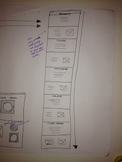
There will be an introductory page then five principles with two sections for each, so, altogether there will be 11 sections. The image below illustrates how the continuous scrolling page will work for this kind of design. The navigation will be on the left for functionality.
Figure-Ground Page
This section of the website will have six pages with a continuos scroll with navigation on the lefthand side.
Gallery Page
The gallery page will have three columns that has a continuos scroll. I'm thinking of using Lightbox for the gallery page as I think it will be the most functional way of displaying the images.
Page Layouts
I have drawn some thumbnails of all the page layouts. I now know what supporting material i need to create in illustrator.


No comments:
Post a Comment